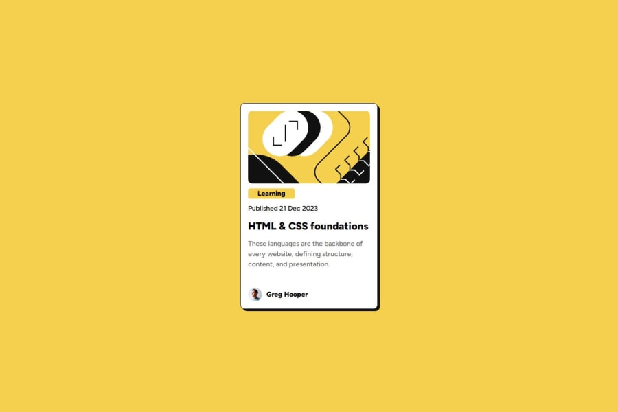


Design comparison
SolutionDesign

Solution retrospective
What are you most proud of, and what would you do differently next time?
Even though it wasn't required, I did add a small hover animation, as I would like to practice more with transitions and animations in general.
What challenges did you encounter, and how did you overcome them?One challenge I had was how to go about aligning the author name and image to the bottom, regardless of the amount of text not being enough to push to the bottom.
I overcame by using flex-grow: 1 on the card copy container so it would take up the extra space, thus pushing the author to the bottom as intended.

Join our Discord community
Join thousands of Frontend Mentor community members taking the challenges, sharing resources, helping each other, and chatting about all things front-end!
Join our Discord