Design comparison
Solution retrospective
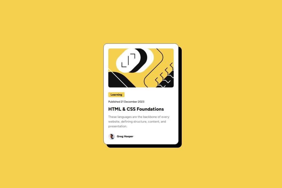
Getting this to match the figma file as closely as possible
What challenges did you encounter, and how did you overcome them?Figuring out how to make the typography fluid without a media query. Math is not my strong suit and I needed a fluid typography generator to figure out the proper clamp
What specific areas of your project would you like help with?Any tips on how to make the typography easier to manage. I like that the clamp really minimized the lines I used but I'm not sure that was the best or more eloquent solution without a media query?
Community feedback
- @fayiz770Posted 11 months ago
Using the clamp() function in CSS is indeed a powerful way to manage responsive typography without the need for media queries. It allows you to set a fluid range for font sizes that scales with the viewport size, providing a more dynamic and flexible solution. However, there are other best practices and tools you can use to further manage and enhance typography in a responsive design.
0
Please log in to post a comment
Log in with GitHubJoin our Discord community
Join thousands of Frontend Mentor community members taking the challenges, sharing resources, helping each other, and chatting about all things front-end!
Join our Discord
