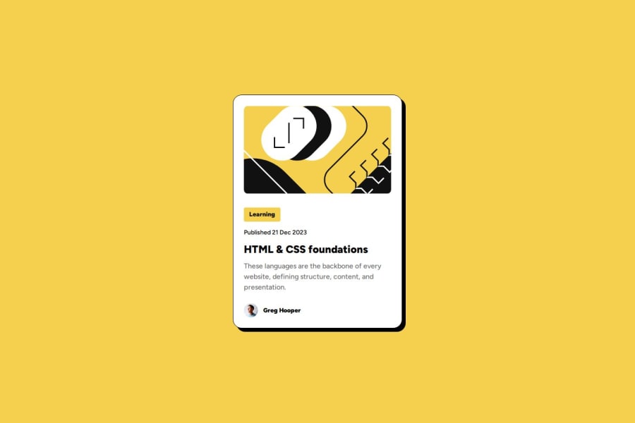
Design comparison
Solution retrospective
Proud that I could implement this challenge as well and it went pretty smooth!
What challenges did you encounter, and how did you overcome them?I was challenged a little bit with the font variable as I didn't used them before!
What specific areas of your project would you like help with?Again! Feedback is always good on tips on how to implement a clean css and html!
Community feedback
- @Islandstone89Posted 1 day ago
HTML:
-
Every webpage needs a
<main>
that wraps all of the content, except for<header>
andfooter>
. This is vital for accessibility, as it helps screen readers identify a page's "main" content. Change.container
into a<main>
. -
As the top image is mostly decorative, it should be avoided by screen readers. Using an
<img>
you do that by setting empty alt text:alt=""
. Since this is an inline SVG, it needs these 2 attributes:aria-hidden: true
andfocusable="false"
. -
Most of the time, you would give elements a class instead of an
id
. This article explains when to use theid
attribute. -
The heading needs a link inside, given this is a blog card.
-
Don't include "picture" in the alt text, since screen readers recognize images by default.
CSS:
-
Always include a CSS Reset at the beginning of the stylesheet.
-
Remember to specify a fallback font:
font-family: 'Figtree',sans-serif;
-
I recommend adding a bit of
padding
, for example16px
, on thebody
, to ensure the card doesn't touch the edges on small screens. -
I would move the styles on
.container
to thebody
. Changeheight
tomin-height: 100svh
- this way, the content will not get cut off if it grows beneath the viewport. -
Except for the profile image, remove all widths in
px
. -
Add
width: fit-content
on.category
, so it doesn't stretch across the full width. -
Add a
max-width
of around20rem
on the card, to prevent it from getting too wide on larger screens. -
font-size
must never be in px. This is a big accessibility issue, as it prevents the font size from scaling with the user's default setting in the browser. Use rem instead. -
Whenever the value is the same on all 4 sides, you only need to write it once. Hence,
padding: 24px 24px 24px 24px;
can be written as a shorthand:padding: 24px
. If the value is the same on the top and bottom, you can usepadding-block
. For left and right, usepadding-inline
.
0 -
Please log in to post a comment
Log in with GitHubJoin our Discord community
Join thousands of Frontend Mentor community members taking the challenges, sharing resources, helping each other, and chatting about all things front-end!
Join our Discord