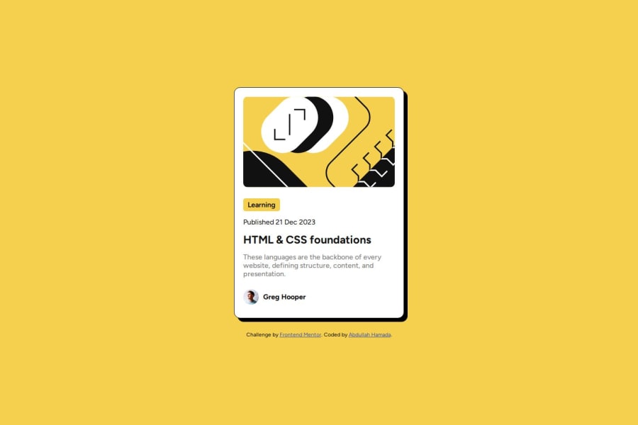
Design comparison
Solution retrospective
Finishing the project pretty quickly.
What specific areas of your project would you like help with?Any design recommendations.
Community feedback
- @danielmrz-devPosted 7 months ago
Hello there!
Congrats on completing the challenge! ✅
Your solution is really impressive!
I've got a couple of ideas (about how to use HTML better) that could make it even stronger:
📌 First: Think about using
<main>to wrap your main content instead of<div>.Imagine
<div>and<span>in HTML as basic containers. They're good for holding stuff, but they don't tell us much about what's inside or its purpose on the webpage.📌 Second: -Don't skip heading levels – start with
<h1>, then use<h2>, and so on.It's more than just text size — it's about structuring your content effectively:
- The
<h1>to<h6>tags are used to define HTML headings. <h1>is for the most important heading.<h6>is for the least important heading.- Stick to just one
<h1>per page – it should be the main title for the whole page.
These tweaks might not change how your page looks, but they'll make your HTML code clearer and help with SEO and accessibility.
Hope that's helpful!
Keep up the great work!
Marked as helpful1@AbdullahHamadaxPosted 7 months ago@danielmrz-dev Thank you, I've changed my code and instead used a
<main>to contain all my stuff then I used a<section>for the image, text, button, etc.Lastly, I've used h1 instead of h3 and played around with the
font-size.0 - The
- @JamesWallison1Posted 7 months ago
Seeing that you have made a lot of progress, congratulation! Really impressive I have to admit. Beside that, there are just a few of minor mistake in your code that I think you can consider fixing:
- First, It is considered to contain your landmark instead of using div, this provides more details and description on how each part works. So, you can consider fixing this by changing
<div></div>into landmarks like:<main></main>or<section></section> - Second in the part Learning, you not need to make it by button but simply it by using p or h1 and the after path you need to add is padding, border-radius and background-color, this will reduce less time than using button.
- Another one I was missing about is media query, also necessary. Your code right here may not need media query. But it is extremely important for your next challenges so remember to add that, maybe it will display your container to column or dislay some three dots,... So remember to add that!
Those are 2 minor mistakes, a missing media query mistake I can tell you because your solution is literally perfect! Keep pushing yourself to become a successful develop :) Thanks a lot for spending time reading this small comment!
Marked as helpful1@AbdullahHamadaxPosted 7 months ago@JamesWallison1 Thank you, I've changed my code and instead used a
<main>to contain all my stuff then I used a<section>for the image, text, button, etc.But I wasn't able to change the button into a
p, It didn't look right, any idea why? I've tried playing around with themax-widthbut nothing fixed it.1@JamesWallison1Posted 7 months ago@AbdullahHamadax I think there is no need to deal with max-width here, if you don't mind, please send the code again because right now I can't access your github repository. I will check out again and maybe come with a better solution. Thanks!
0@JamesWallison1Posted 7 months ago@AbdullahHamadax So, I have reviewed your code again on your github page. And well, here it is! Check your github news, I have made some changes on your html and css. Hope you will receive!
1 - First, It is considered to contain your landmark instead of using div, this provides more details and description on how each part works. So, you can consider fixing this by changing
Please log in to post a comment
Log in with GitHubJoin our Discord community
Join thousands of Frontend Mentor community members taking the challenges, sharing resources, helping each other, and chatting about all things front-end!
Join our Discord
