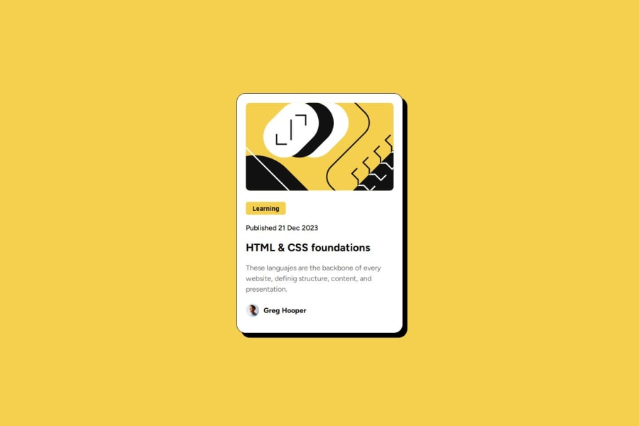


Design comparison

Community feedback
- @Silo30Posted about 2 months ago
Hello! I really liked your solution. It's very close to the original model, but i notice some things that could be improved.
I noticed that in your code you made a entire new card to use as the card-shadow. That's a lot of unnecessary work, as there is a CSS property to generate a shadow to a element frame.
box-shadow: 10px 10px;try adding this to your
.cardclass and the div for.card-shadowshouldn't be necessary anymore.Also, your h1 title doesn't change color when the mouse hover over it like the challange proposes. You can do it by adding these lines to the Style.css:
.card-content h1 {
  margin: 0;
}
beyond that, it's a very well done solution. I hope this review was helpful to you.
0

Please log in to post a comment
Log in with GitHubJoin our Discord community
Join thousands of Frontend Mentor community members taking the challenges, sharing resources, helping each other, and chatting about all things front-end!
Join our Discord