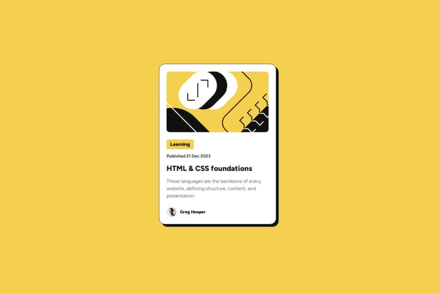
Design comparison
Solution retrospective
I have added animation when you click the card, you can try if you want
Community feedback
- @ebenkaninPosted 3 months ago
Hi Hoang,
Loved your solution, especially the bit where the header changes color when you mouse over it. I wish i'd thought about that in my solution. Why did you decide to do it that way though? If it were a button or a link, that'd be very self explanatory but i would love to know if this is a new UI/UX practice.
0@Ha0n9Posted 3 months agoI have seen a lot of websites using a card as a link that will take the user to a specific website where the user can make a payment or maybe some advertising website. But in this challenge, they ask you to create a hover effect when you hover on the card title, it will change color as you can see in the Figma design file. I think it would be better to add some animation using the :active pseudo class and the transform property to create the click animation since the card already has the box-shadow property as you can see. It is a better way to use the other knowledge I have learned to practice using it on multiple projects, which will help me master it faster.
0 - @ebenkaninPosted 3 months ago
Hi Hoang,
Loved your solution, especially the bit where the header changes color when you mouse over it. I wish i'd thought about that in my solution. Why did you decide to do it that way though? If it were a button or a link, that'd be very self explanatory but i would love to know if this is a new UI/UX practice.
0
Please log in to post a comment
Log in with GitHubJoin our Discord community
Join thousands of Frontend Mentor community members taking the challenges, sharing resources, helping each other, and chatting about all things front-end!
Join our Discord