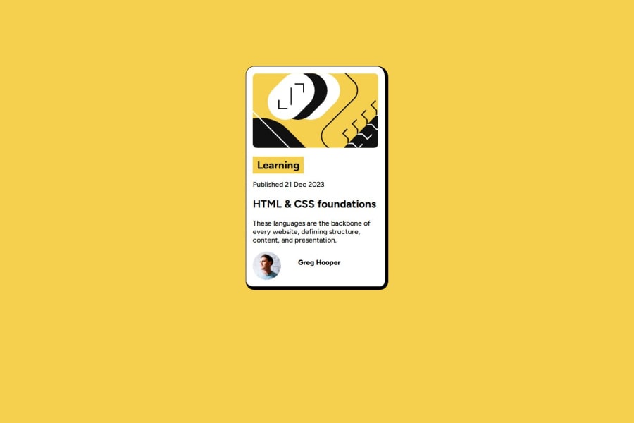


Design comparison

Solution retrospective
I am glad that this particular project adapts well to different screen sizes. I am proud of mastering the act of building responsive designs.
What challenges did you encounter, and how did you overcome them?I had problems with the fonts and border styling. I read through a resource on web3 schools
What specific areas of your project would you like help with?Google fonts aren't loading in my projects. Any help would be appreciated.
Community feedback
- @StroudyPosted about 2 months ago
@Komans-Hub, I’d like to provide some feedback. In past challenges, I noticed you haven't engaged or responded when solutions were submitted. Networking and actively engaging with the community are essential, and I highly encourage you to embrace these practices. They can greatly enhance collaboration and growth.
Marked as helpful0@StroudyPosted about 2 months agoHey @Komans-Hub, No problem, Good to see you here!
0 - @SvitlanaSuslenkovaPosted about 2 months ago
Try this embed code in the <head> of your html
<link rel="preconnect" href="https://fonts.googleapis.com"> <link rel="preconnect" href="https://fonts.gstatic.com" crossorigin> <link href="https://fonts.googleapis.com/css2?family=Figtree:ital,wght@0,300..900;1,300..900&display=swap" rel="stylesheet">Marked as helpful0 - @fwillardPosted about 2 months ago
The card is cramped on screen sizes above 600 pixels and below ~1400 pixels. It may be helpful to do
.container{ width: 90%; max-width: 21.5rem;}.This will allow the container to take up 90% of the view on smaller screens, but then stay at a defined width once you reach 21.5rem (344px). This allows the design to still be responsive for all screen sizes, but removes the need for media queries and allows a smother transition between sizes.
0


Please log in to post a comment
Log in with GitHub
Join our Discord community
Join thousands of Frontend Mentor community members taking the challenges, sharing resources, helping each other, and chatting about all things front-end!
Join our Discord