

Design comparison
SolutionDesign

Community feedback
- @melanielogan74Posted 3 months ago
This was a very good attempt! I broke down my feedback per file.
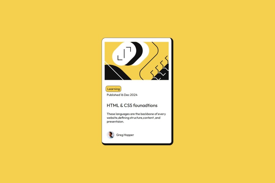
HTML
- Try to use more descriptive names for your classes. Using terms like header, textarea, text can be confused with tags and reserved words. Choose something like class="card-header" to help differentiate.
- Also, try not to use so many div tags. This can make it hard to debug and troubleshoot any issues.
- There's a misspelling of the word "foundations"
CSS
- This looks great! You organized the styling well and used some items I haven't seen anyone use (i.e. transform)
- The image needs a border-radius
- Learning should not have a border and should be bolded.
- Your main header and the name should be bold text.
Overall, great job!
Marked as helpful1

Please log in to post a comment
Log in with GitHubJoin our Discord community
Join thousands of Frontend Mentor community members taking the challenges, sharing resources, helping each other, and chatting about all things front-end!
Join our Discord