Not Found
Not Found
Not Found
Not Found
Not Found
Not Found
Not Found
Not Found
Not Found
Not Found
Not Found
Not Found
Not Found
Not Found
Not Found
Not Found
Not Found
Not Found
Not Found
Not Found
Desktop design screenshot for the Blog preview card coding challenge

This is a solution for...

  • HTML
  • CSS
1newbie
View challenge

Design comparison


SolutionDesign

Solution retrospective


What are you most proud of, and what would you do differently next time?

I'm proud that even before I started I already knew what I had to do

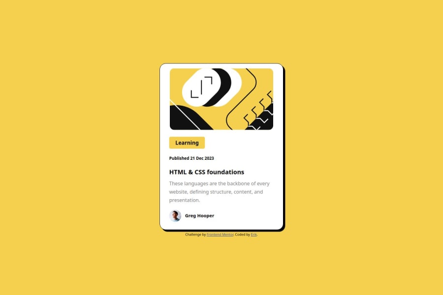
What challenges did you encounter, and how did you overcome them?

That little guy picture and his name right next to the image, it took me a while to put them together

What specific areas of your project would you like help with?

How can I put things next to each other more easily?

Community feedback

Alex 3,130

@Alex-Archer-I

Posted

Hi!

The most ease way to arrange items is flex. I see you're already familiar with it =) You can use flex property gap to create gaps between elements instead of margins - sometimes it could be more convenient. And fex-direction: row is a default value, so you haven't apply it explicitly.

To make indents from the borders inside your .quadrado element it'll be better to use padding on it than margin-right to every inner element.

Also try to use one p tag for the whole text block instead of separate tag for every line - in real projects it would make more difficult to maintain the project.

And in the end I recommend you to learn about relative values - rem and em and start to use them at least for font sizing.

Overall, you did quite a decent job! Keep doing =) Good luck and happy coding =)

Marked as helpful

0

@Saimgkdn

Posted

it was a project I did with fun

0

Please log in to post a comment

Log in with GitHub
Discord logo

Join our Discord community

Join thousands of Frontend Mentor community members taking the challenges, sharing resources, helping each other, and chatting about all things front-end!

Join our Discord