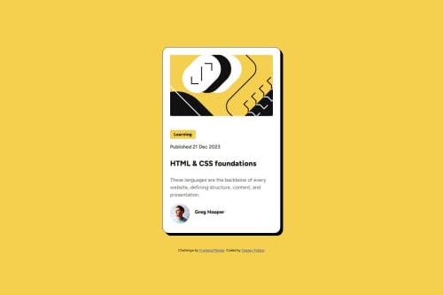
Blog card preview using FlexBox and mobile first design
Design comparison
Solution retrospective
I practiced using a mobile-first approach. I practiced using Figma to get the design specs.
What specific areas of your project would you like help with?- How do I change the font size at mobile size screens without using media queries?
Community feedback
- @Mesud-AhmedPosted about 2 months ago
also to make the card responsive on small screen sizes, you can just add these stylings on the .container class
width: 100%; /* to Allow flexibility and also to avoid horizontal scroll*/ max-width: 384px; /* to prevent the card taking too much space on larger screens*/
Marked as helpful1@cfofanaPosted about 1 month ago@Mesud-Ahmed Thanks. Just implemented your suggestions. The width:100% stopped the overflow at very small screen sizes.
0 - @DarkstarXDDPosted about 2 months ago
- You can use the
clamp()
CSS function to change the font size based on the screen size, instead of using media queries.
Couple of other suggestions.
- Make sure you are always using
rem
for font sizes. Currently in your variables you have defined the font sizes inrem
, but on thebody
you are usingpx
. - Instead of using
width
, usemax-width
for the container size. When you usewidth
the container can't scale below that size even if the screen sizes shrinks. This won't be very obvious in this specific situation since in this case thewidth
value is around330px
, but still it's better to get into the habit of avoiding fixedwidths
for containers that contain text. So instead usemax-width
, which allows the container to scale down when there is not enough space in the screen to fit. - The
HTML & CSS
element should be the heading of this card. Not ap
. You can use ah1
for that. On a real site it won't probably be theh1
since there will be multiple cards like these on a page, and theh1
of the page would be something else that describes the content of the whole page, so in that case this would probably be ah2
. But in the given scenario this can be theh1
. - Make sure you are using a
<main>
landmark element. It should wrap all the content of your page except the contents of<header>
and<footer>
. In this project you don't have a<header>
. But you do have a<footer>
. The content of the attribution should ideally go inside a<footer>
and it should be outside of the<main>
. So it will look like this.
<html> <head></head> <body> <header></header> //Not relevant in this project <main></main> <footer>Your attribution content</footer> <body> <html>
Marked as helpful1@cfofanaPosted about 1 month ago@DarkstarXDD Thanks so much. I didn't even know about the clamp css function. I checked it out on canIuse too. The browser support is growing so I reckon it must be safe to use? As for the rem, I was under the impression that I had to set the root font size on the body. Instead of the body, it's actually the html element that's the root, which by default, is 16px in most cases. I also changed the structure of the page to make it more html5 compliant. Thanks so much for all your suggestions.
0@DarkstarXDDPosted about 1 month ago@cfofana Yeah you can use
clamp()
without worrying about browser support. It's good to know how to use clamp and get some experience with it, though i personally don't use it much. Mainly because i don't like my font sizes changing between screen sizes, and when i want them to change I'll do it in a media query.As for the body font size... Yeah you are not setting the root font size in the body. And you don't want to mess with the root font size in the
html
element. You really never have to set anything on thehtml
element it self. But you can always set a font size for thebody
. For example think you entire site uses the font size of18px
except for couple of headings that have a different font size. In that case you can set the18px
font size (inrem
) on thebody
. So all the elements will inherit that and you don't have to set the font size on individual elements. And on the couple of heading elements that use a different font size, you can overwrite the font size on their element level. Just make sure whenever you are setting font sizes to set them inrem
.0 - You can use the
- @tharun-32Posted about 2 months ago
I made the same mistake as you did don't use Flexbox for this project you can't increase the width which makes the preview card smaller. instead, use margin property margin:5rem 2rem; this makes the card in the center in the mobile screen then in the window or large screen set the required width and margin-inline: auto; this centers the card. try this it will work, if you want take a look at my code or watch YouTube you will get a better understanding.
Marked as helpful0
Please log in to post a comment
Log in with GitHubJoin our Discord community
Join thousands of Frontend Mentor community members taking the challenges, sharing resources, helping each other, and chatting about all things front-end!
Join our Discord