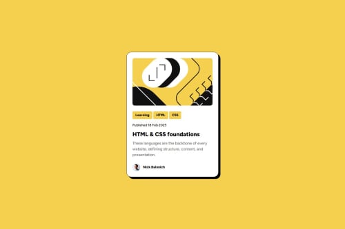
Blog Card Preview Responsive Design

Solution retrospective
In general, I completed this challenge pretty fast without any help, so I'm more confident in building layouts.
Also figured out that the gaps between sections are the same, so it came into my mind that the same thing can be achieved not with margins and paddings, but with flexbox gap, in this case flex-direction: column; must be used.
And one more thing: even though only one category is shown on the design, there could be more, so I added more categories as list elements, each following the design by child selector rule.
In Figma, font weights don't have numbers, they're just called "bold," "extra bold," and so on, so it was hard for me to figure out which numbers to use for the font weights.
What specific areas of your project would you like help with?I'm just generally interested in whether I'm really creating responsive designs, because the first two challenges don't offer any really hard designs for mobile, they're actually the same as the desktop version.
Please log in to post a comment
Log in with GitHubCommunity feedback
No feedback yet. Be the first to give feedback on Balonich's solution.
Join our Discord community
Join thousands of Frontend Mentor community members taking the challenges, sharing resources, helping each other, and chatting about all things front-end!
Join our Discord