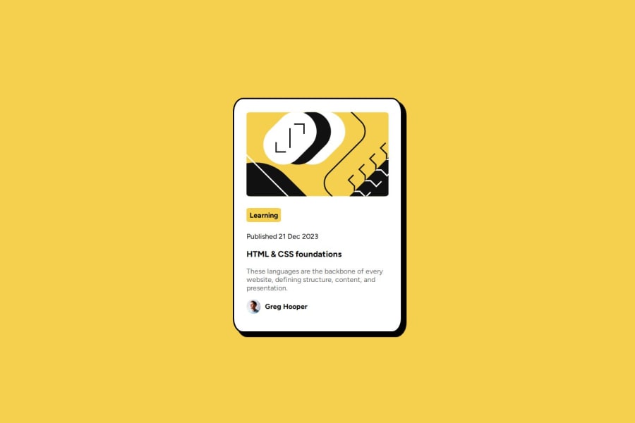
Design comparison
SolutionDesign
Solution retrospective
What are you most proud of, and what would you do differently next time?
After log time completed this basic frontend project. I enjoyed this development process. i will try to complete it more faster way.
Community feedback
- @vighgivPosted 6 months ago
This looks really promising! A few small tweaks could make a big difference:
- Never set fixed widths, instead use
max-widthas it will prevent overflowing. - Be careful when using percentages for width. You can see that at the 601px breakpoint the card becomes very narrow. What do you think you should replace
width: 27%with?
Marked as helpful0@Atharva90gitPosted 6 months agoThanks for suggestion @vighgiv, i will defiantly follow this in my next challenge!!!...
0 - Never set fixed widths, instead use
Please log in to post a comment
Log in with GitHubJoin our Discord community
Join thousands of Frontend Mentor community members taking the challenges, sharing resources, helping each other, and chatting about all things front-end!
Join our Discord
