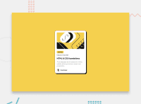
Design comparison
Solution retrospective
How would I get the main container directly in the center of the browser page on the top and bottom like the example?
I'm open to any and all feedback. Thanks!
Community feedback
- @MathiasDWaterlawPosted 8 months ago
Great solution! if you want to center better the preview card you can add this to the css:
body {
display: flex;
flex-direction: column; <- -otherwise the attribution section goes to the right-
align-items: center;
justify-content: center;
min-height: 100vh;
}
and then you need to delete the padding property on the body
Marked as helpful1@DevonHughesCodesPosted 8 months ago@MathiasDWaterlaw Thanks a lot!!! I just tried out your fix and it worked perfectly. That's seriously a big help. I'm still grasping flex boxes and positioning the content within them. You're awesome!
1@MathiasDWaterlawPosted 8 months ago@DevonHughesCodes glad to help! i've learned a lot on flexbox by watching this video: https://www.youtube.com/watch?v=phWxA89Dy94 maybe can be helpful also for you!
Marked as helpful1
Please log in to post a comment
Log in with GitHubJoin our Discord community
Join thousands of Frontend Mentor community members taking the challenges, sharing resources, helping each other, and chatting about all things front-end!
Join our Discord

