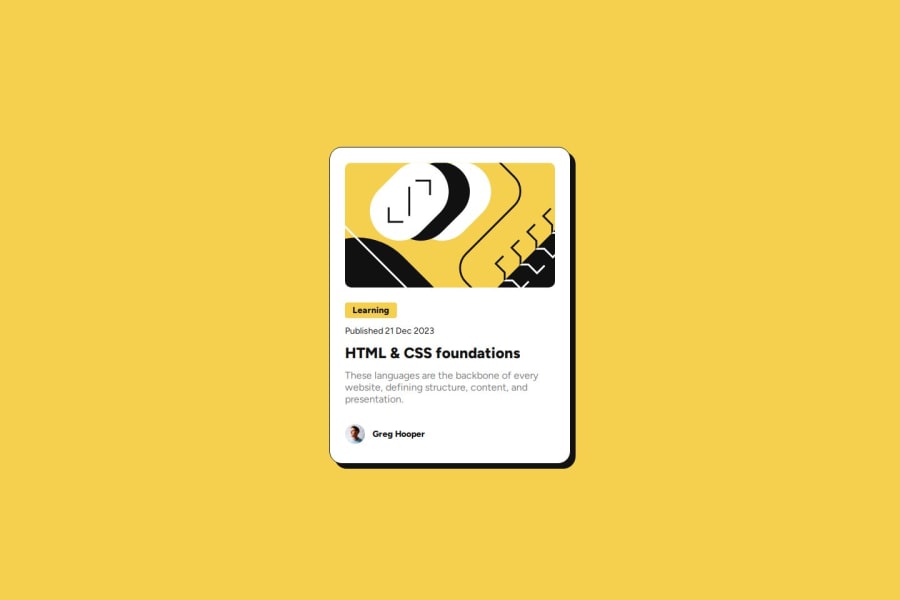
Design comparison
SolutionDesign
Solution retrospective
What are you most proud of, and what would you do differently next time?
This one went really smoothly! I added some variables for the theme colors. I've seen this done before, but hadn't tried it myself.
What challenges did you encounter, and how did you overcome them?I had to get a refreshers on css selectors to ensure that the title text changed color when you hovered over the card/container element.
What specific areas of your project would you like help with?Are there any ways that I could streamline my code?
Community feedback
Please log in to post a comment
Log in with GitHubJoin our Discord community
Join thousands of Frontend Mentor community members taking the challenges, sharing resources, helping each other, and chatting about all things front-end!
Join our Discord
