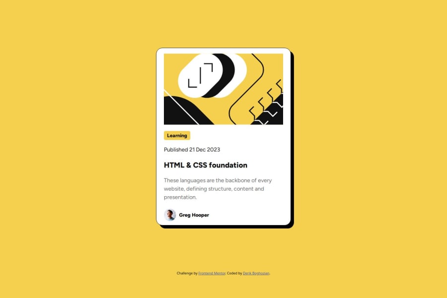
Design comparison
Solution retrospective
I'm proud to have learned how to import and use fonts from an assets folder, add delayed hover transitions for a polished design, and I'm overall happy with the way my project turned out. Next time I will take care to read the hints provided at the bottom of the Frontend Mentor assignment page. Also, I will need to study how to properly structure my code for precise CSS spacing.
What challenges did you encounter, and how did you overcome them?There were a few problems I encountered and had to Google: how to import fonts from the assets folder, proper usage of flex and spacing, and also how to add transition delays for a polished feel on hover effects.
What specific areas of your project would you like help with?The primary areas I need help with are flex spacing to more precisely fit and space all content inside a div. Also, I'd like to learn more about how to scale font size with window size. Additionally, I think I can make my overall HTML and CSS structure a bit better for easier reading and accessibility.
Community feedback
- @gabrilovPosted 7 months ago
Hello! It's almost perfect. Maybe a slight difference in proportion (probably a little more bottom padding). Congratulations :)
0
Please log in to post a comment
Log in with GitHubJoin our Discord community
Join thousands of Frontend Mentor community members taking the challenges, sharing resources, helping each other, and chatting about all things front-end!
Join our Discord
