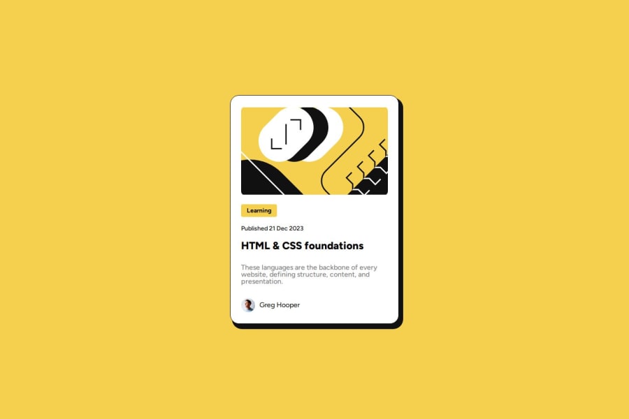
Design comparison
Solution retrospective
Thing I am most proud of is the speed at which I can now complete HTML & CSS projects. Things I would do differently next are using a CSS pre-preprocessor and maybe a little JS for some slight animation.
What challenges did you encounter, and how did you overcome them?During this project I didn't encounter any challenges.
What specific areas of your project would you like help with?The only thing I can think of is sizing and positioning. The s&p seems off when I compare the exact specs from the sketch file to my actual code.
Community feedback
- @AkoToSiJeromeEhPosted 11 months ago
Hey ! Great Work Out there i just notice that you are using padding-top: 20px; on each content to make space between items in card i just want to suggest that instead of using padding on each item you can use the gap css property that will provide a space in each item on your card and since you are using display : flex in the .container you can assign the gap property and give its value you want and units you want like px or rem . thats all happy coding !!
.container {
  background-color: var(--white);
  border: 1px solid var(--black);
  display: flex;
  flex-direction: column;
  align-items: center;
  height: 522px;
  width: 384px;
  border-radius: 20px;
  box-shadow: inset 0 0 0 2px black;
  -webkit-box-shadow: 7px 9px 0px 3px var(--black);
  -moz-box-shadow: 7px 9px 0px 3px var(--black);
  box-shadow: 7px 9px 0px 3px var(--black);
  gap: 10px; // by adding this you can adjust the value and remove padding-top on each item
}
0
Please log in to post a comment
Log in with GitHubJoin our Discord community
Join thousands of Frontend Mentor community members taking the challenges, sharing resources, helping each other, and chatting about all things front-end!
Join our Discord
