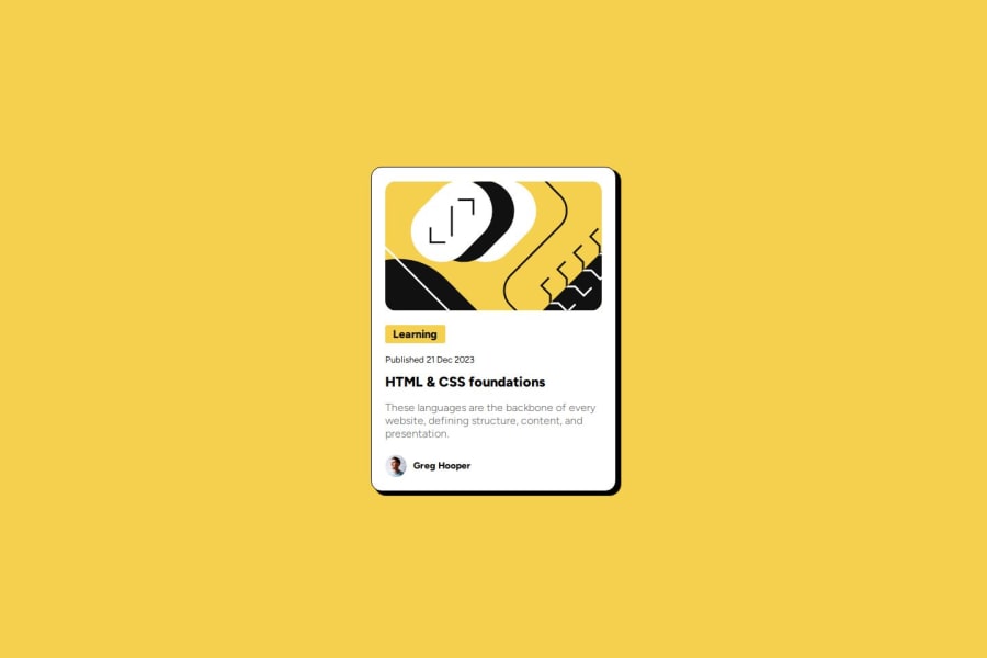
Design comparison
Solution retrospective
I did my best, and I'm content with the result. I'll maybe change the way I start designing. Which is, desktop first then mobile. There isn't much styling with the beginners' projects so starting with the desktop design makes sense. At least for now.
What challenges did you encounter, and how did you overcome them?First, I couldn't center the container vertically but I figured it out. Then, the elements were overflowing outside the border, so I had to look for a solution.
What specific areas of your project would you like help with?1- Containing elements. 2- Whether or not to start with mobile design first. 3- Aligning items. 4- Should I use a lot of divs?
Community feedback
Please log in to post a comment
Log in with GitHubJoin our Discord community
Join thousands of Frontend Mentor community members taking the challenges, sharing resources, helping each other, and chatting about all things front-end!
Join our Discord
