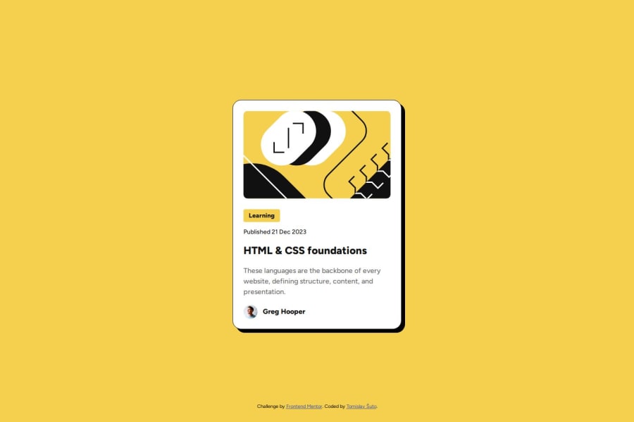
Design comparison
Solution retrospective
I am glad I found a solution to scale down all elements without using @media query.
I should have thought things through better before starting to write HTML.
What challenges did you encounter, and how did you overcome them?Scaling elements, especially fonts, with viewport is fiddly. I had to choose an arbitrary number or find the closest one that fits.
What specific areas of your project would you like help with?I used clamp with viewport to scale elements between two values. The problem is that this way each element scales at its own rate (even though scaling is smooth individually).
Is there a way to have each element scale in unison using clamp? Or if there is a better way to do this?
Is there maybe a way to scale elements between two numbers, i.e. interpolating?
Community feedback
- @Katte18Posted 5 months ago
very good descriptive alt text and there's semantic html. Accessibility also good. Not quite responsive less 375px and the attribution is overlapped with the card component. There's a simple solution for it. Really good match design. Great job!
0
Please log in to post a comment
Log in with GitHubJoin our Discord community
Join thousands of Frontend Mentor community members taking the challenges, sharing resources, helping each other, and chatting about all things front-end!
Join our Discord
