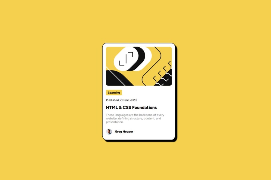
Design comparison
SolutionDesign
Solution retrospective
What are you most proud of, and what would you do differently next time?
I'm starting to use various css units to design my card an I'm starting to understand some layout placement. Maybe I'll try to use another method next time
What challenges did you encounter, and how did you overcome them?I have some difficulties when I'm trying to change element attributes when my pointer is pointing in another element. Actually, can we do that? My current solution is changing them one by one.
Community feedback
Please log in to post a comment
Log in with GitHubJoin our Discord community
Join thousands of Frontend Mentor community members taking the challenges, sharing resources, helping each other, and chatting about all things front-end!
Join our Discord
