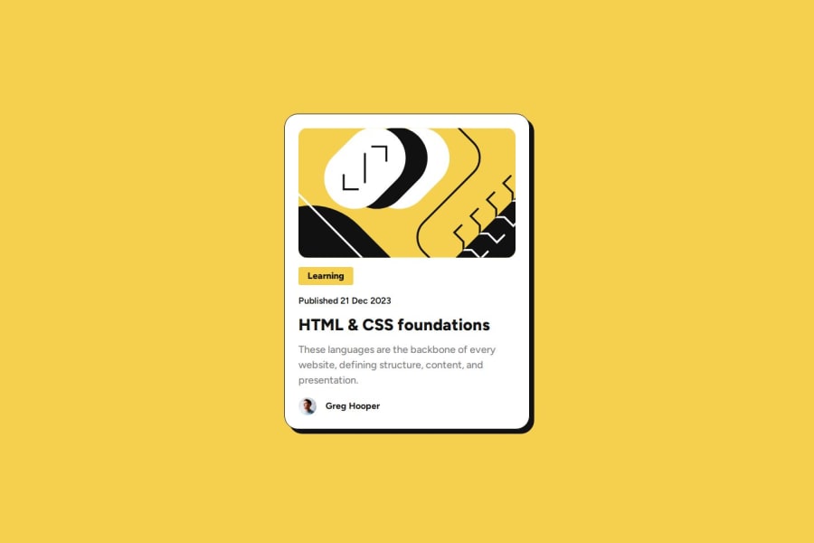
Blog Card - Flexbox, transition, hover state.
Design comparison
Solution retrospective
-
I would like to know if my HTML markup is good like this, or if I could improve it somehow.
-
I think I tend to overcomplicate myself when doing the styling, is there a better way to do it taking this file as a reference?
Community feedback
- @noelhoppePosted 9 months ago
Your html looks well structured and you choice a very efficient way. Well done!
0@FernJBatistaPosted 9 months ago@noelhoppe Thank you! I've been binge watching videos on how to try to keep everything properly structured. Glad to hear you find it efficient!
0 - @Ezekiel225Posted 9 months ago
Hello there 👋 @FernJBatista.
Good job on completing the challenge !
Your project looks really good!
I have a suggestion about your code that might interest you.
There is an very useful browser extension called Perfect Pixel that allow you compare with the design image and thus see the exact dimensions. I recommend it to you.
I hope this suggestion is useful for future projects.
Keep up the excellent work and continue to challenge yourself with new projects. Your progress is impressive, and each project is a step forward in your front-end development journey! 🚀🌟.
Other than that, great job!
Happy coding.
0@FernJBatistaPosted 9 months ago@Ezekiel225 Thanks! I might be using it to get my designs a bit more accurate.
0
Please log in to post a comment
Log in with GitHubJoin our Discord community
Join thousands of Frontend Mentor community members taking the challenges, sharing resources, helping each other, and chatting about all things front-end!
Join our Discord
