Blog Card | Flexbox solution


Design comparison

Solution retrospective
I am proud of successfully utilizing flexbox in this challenge and completing it with a high level of energy.
What challenges did you encounter, and how did you overcome them?Upon initially downloading the assets, I encountered difficulty in creating responsive card. As a result, I took the initiative to educate myself on Flexbox before proceeding with this challenge.
Community feedback
- @Pelumi72Posted 3 months ago
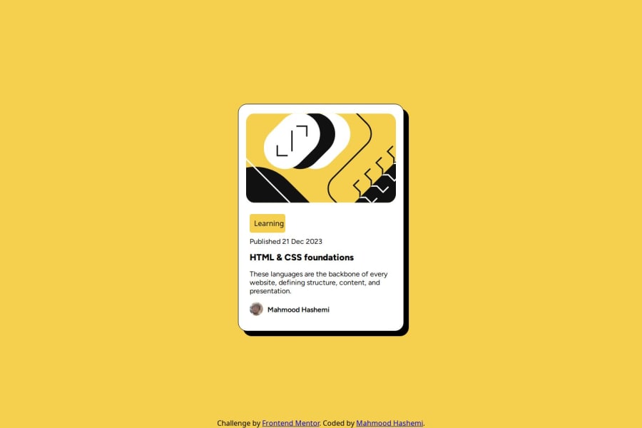
I really like your design, it is so close to the original design. The only thing that I see is that the "learning" which is in an anchor<a> tag in my opinion, though I might be wrong, is not a button. I think you can make it a header<h1-h6> or paragraph<p> element. Then style it like this background-color: hsl(47, 88%, 63%); display: inline; padding: 5px; border-radius: 3px;
1@MahmoodHashemPosted 3 months ago@Pelumi72
Thank you for your feedback and time. However, the use of the anchor tag is essential here because it serves as a link, providing navigation or directing users to specific resources. Headings and paragraphs are primarily designed for structuring content and conveying information, not for linking purposes. Using the correct HTML element ensures both functionality and semantic accuracy, which improves accessibility and user experience.
1

Please log in to post a comment
Log in with GitHubJoin our Discord community
Join thousands of Frontend Mentor community members taking the challenges, sharing resources, helping each other, and chatting about all things front-end!
Join our Discord