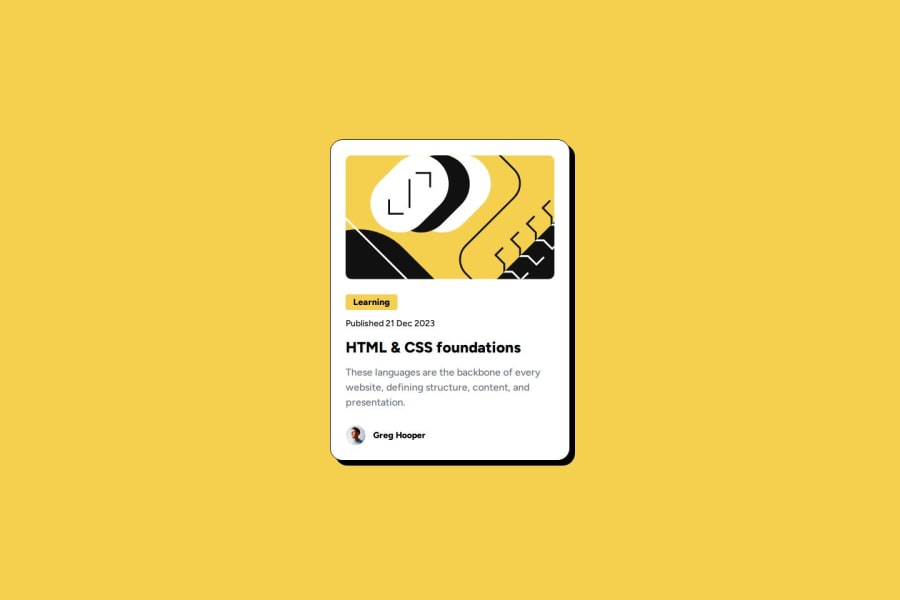
Design comparison
Solution retrospective
I'm most proud of how I leveraged Tailwind CSS to create a clean, responsive layout efficiently. Tailwind's utility-first approach allowed me to rapidly style components while keeping my HTML readable and maintainable. I was also pleased with the responsiveness across different devices, which Tailwind made straightforward to implement.
Next time, I would focus on optimizing my design process further. I’d like to explore customizing the Tailwind config more deeply to better match the project's specific design needs and improve reusability. Additionally, I could plan out component structures earlier to minimize code repetition and make the solution even more modular.
What challenges did you encounter, and how did you overcome them?One of the main challenges I faced was ensuring that the layout remained responsive across various screen sizes, especially when working with complex grid structures. While Tailwind CSS simplifies a lot of the styling, finding the right balance between breakpoints and maintaining the design consistency took some effort. To overcome this, I used Tailwind's built-in responsive utilities, which allowed me to quickly adjust layouts for different devices.
Another challenge was managing the HTML structure to prevent class clutter from Tailwind's utility classes. I overcame this by organizing my code carefully, grouping related classes, and making good use of reusable components where possible. This kept my markup clean and maintainable.
What specific areas of your project would you like help with?I’d like feedback on how to further optimize my use of Tailwind CSS, especially in terms of making the design more scalable for larger projects. Suggestions on improving the organization of utility classes and using Tailwind’s configuration for custom styling would be valuable.
Additionally, I’m interested in learning more about accessibility best practices. While I ensured basic accessibility in terms of semantic HTML and keyboard navigation, I'd appreciate advice on how to refine this aspect further to improve the user experience for all audiences.
Community feedback
Please log in to post a comment
Log in with GitHubJoin our Discord community
Join thousands of Frontend Mentor community members taking the challenges, sharing resources, helping each other, and chatting about all things front-end!
Join our Discord
