

Design comparison
SolutionDesign

Solution retrospective
What are you most proud of, and what would you do differently next time?
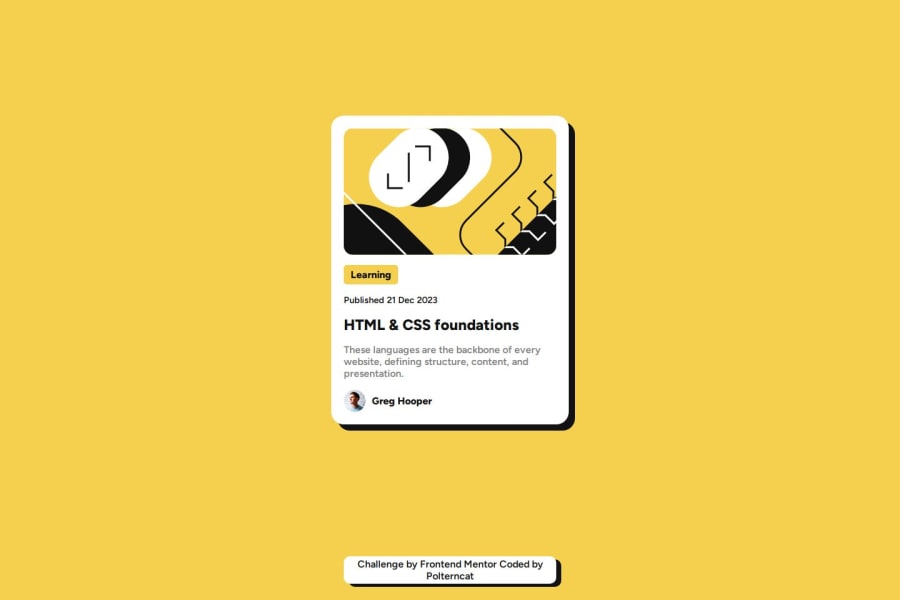
I liked the end result for the shadows and hover effects. I would like to keep working on flex then proceeding onto grid
What challenges did you encounter, and how did you overcome them?My initial intention was to set the "attribution container" at the utmost bottom while keeping the "card container" in the middle. I found it the impossible since justify-self doesn't work on flex. if this scenario is possible with flex alone id like to know how to
What specific areas of your project would you like help with?I know "align-items" aligns depending on "flex-direction", however is there any alternative to "justify-self" for flex when aligning items either vertically or horizontally?
Community feedback
Please log in to post a comment
Log in with GitHubJoin our Discord community
Join thousands of Frontend Mentor community members taking the challenges, sharing resources, helping each other, and chatting about all things front-end!
Join our Discord