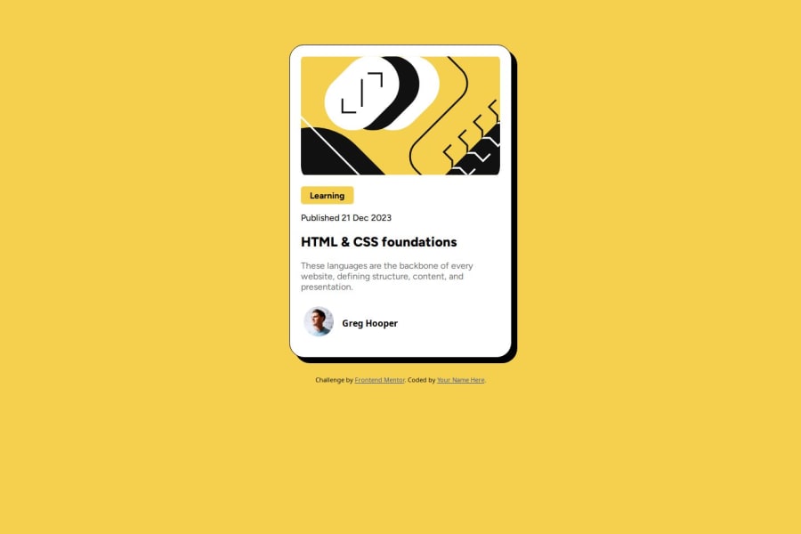
Design comparison
Solution retrospective
This is my third "newby" project and i realized I could do some of the things much easier than the last two projects so I guess I'm proud of making progress!
What challenges did you encounter, and how did you overcome them?I guess the footer was a little bit of a challenge, as well as making the code responsive. I will keep practicing with responsiveness until I feel confident.
Community feedback
- @O-Julia-OPosted 4 months ago
Hello, LaStellaa!
You are doing a great job! But I noticed that you are struggling with positioning the content in the center of the page. I would recommend two options for that. You can write in main block
Flexbox:
display: flex;
justify-content: center;
align-items: center;
min-height: 100vh;
or GRID(almost the same) :
display: grid;
place-items: center;
min-height: 100vh;
Both of them are good, but second is a bit shortly version.
Also here two good links to find out more information about flexbox and grid.
FlexBox: https://css-tricks.com/snippets/css/a-guide-to-flexbox
Grid: https://css-tricks.com/snippets/css/complete-guide-grid
Have a good time :)
Marked as helpful1@LaStellaaPosted 4 months ago@O-Julia-O Yes I do struggle a bit with centering, thank you very much for the advice, I appreciate it!! Wish you a good day!
0
Please log in to post a comment
Log in with GitHubJoin our Discord community
Join thousands of Frontend Mentor community members taking the challenges, sharing resources, helping each other, and chatting about all things front-end!
Join our Discord
