Design comparison
Please log in to post a comment
Log in with GitHubCommunity feedback
- @CamiloBeltran24
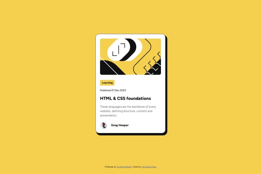
Hi Pablo ! Great Job ! From what I can see of the site, great job overall ! You’re doing really well. Here are a few accessibility suggestions to consider as you keep improving:
-
Try to use header tags in semantic order, starting with an h1 rather than jumping directly to an h5. This helps screen readers better understand the content structure.
-
Consider using aria-labels and avoiding empty links, as these elements improve accessibility and provide a better experience for all users.
It looks like there’s an issue with your GitHub link, so we’re unable to view your code and provide full feedback. I recommend checking it so you can get input from the community.
Keep up the great work, and best of luck with the project!
-
Join our Discord community
Join thousands of Frontend Mentor community members taking the challenges, sharing resources, helping each other, and chatting about all things front-end!
Join our Discord
