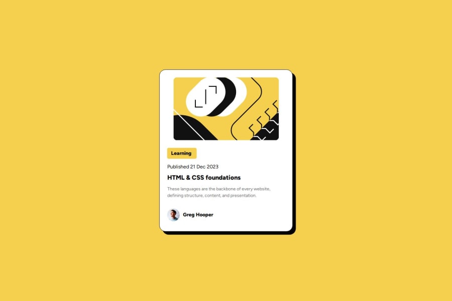


Design comparison
SolutionDesign

Solution retrospective
What are you most proud of, and what would you do differently next time?
I learned how to use rem a lot in this case and more about padding and margins. In my previous example, I used a lot of px when I think rem is better for consistency.
What challenges did you encounter, and how did you overcome them?I struggled with alignment and padding, but I overcame them by trying and trying again.
What specific areas of your project would you like help with?I would like more help with media queries, since I built it first from a mobile design, but couldn't quite get the same look when I switched to desktop.
Community feedback
- @Ali-LearnerPosted about 2 months ago
The design looks pretty good, but I think the image width should be set to 100% (relative to the parent element) to remove any sort of misalignment
0

Please log in to post a comment
Log in with GitHubJoin our Discord community
Join thousands of Frontend Mentor community members taking the challenges, sharing resources, helping each other, and chatting about all things front-end!
Join our Discord