Design comparison
Community feedback
- @Gokul221Posted 2 months ago
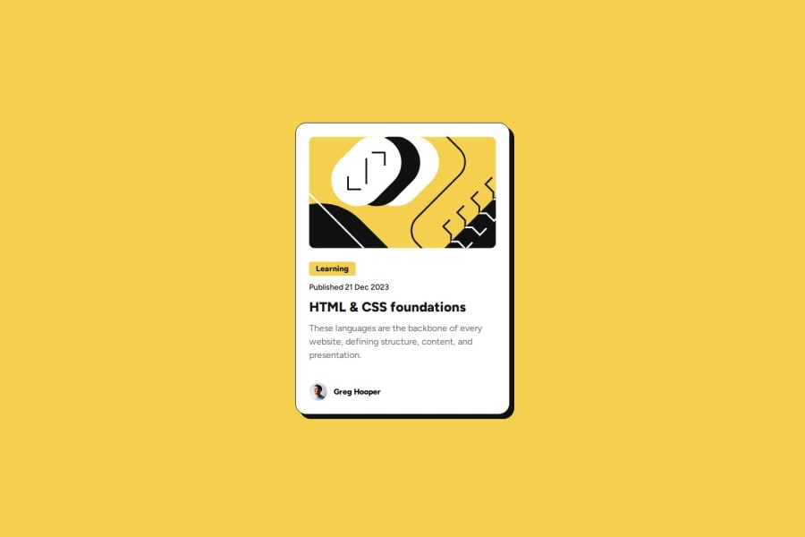
Great work @bobek1337! Page is well responsive for small screens but you can add multiple breakpoints (480px, 768px, 1024px, 1200px) to make it more responsive. Typography is on point just the margins need to be applied to get it almost like the expected design. You can refer to the figma file for accurate dimensions, margins and hover effects (transition delays and box shadow transition). Overall, great work.
0
Please log in to post a comment
Log in with GitHubJoin our Discord community
Join thousands of Frontend Mentor community members taking the challenges, sharing resources, helping each other, and chatting about all things front-end!
Join our Discord
