Design comparison
SolutionDesign
Solution retrospective
What are you most proud of, and what would you do differently next time?
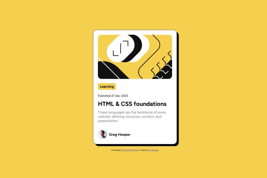
i think the font style and sizing is spot on. also figuring out the box shadow and making it interactive with hover.
What challenges did you encounter, and how did you overcome them?How to write out the box shadow. quick google search and i had found a solution.
What specific areas of your project would you like help with?what is the best way to size these cards. as of now i am going off of just putting in px sizing and changing it till it looks good.
Community feedback
Please log in to post a comment
Log in with GitHubJoin our Discord community
Join thousands of Frontend Mentor community members taking the challenges, sharing resources, helping each other, and chatting about all things front-end!
Join our Discord
