@SvitlanaSuslenkova
Posted
Marked as helpful
What specific areas of your project would you like help with?
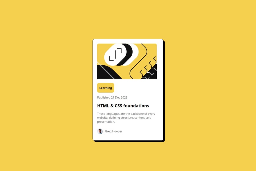
@SvitlanaSuslenkova
Posted
Marked as helpful
@yt021
Posted
try center align image by setting a width for it. everything else is good. good job.
@V0zmo
Posted
Hello! Thank you for your feedback on my project. I also would like to give you feedback as my gratitude! Although Svitlana Suslenkova already answered your question. I would also like to share my approach to it, without changing the code and only adding some additional code.
No.1 - It seems like the reason the Learning tag taking that height is because of the margin. A simple fix could be done by adding this line of code.
.tag {
font-weight: bold;
color: #000;
margin: .2rem; /* ADDED */
}
You can modify it based on your preferences.
No.2 - For the image size it seems it doesn't cover the entire card-image-wrapper class. A simple fix could be done by adding this 4-line code.
/* ADDED */
.card-image-wrapper img{
width: 100%;
height: auto;
object-fit: cover; /* This is not necessary */
}
No.3 - For the image I can't quite be sure if it's the wrong size. But for me, it's already the perfect size.
You can check what goes wrong with the Inspect Element tool by pressing F12 (each browser sometimes has a different shortcut) or right-clicking the browser and selecting the Inspect Element option on the bottom list.
Overall a good code!🤩
Join thousands of Frontend Mentor community members taking the challenges, sharing resources, helping each other, and chatting about all things front-end!
Join our Discord