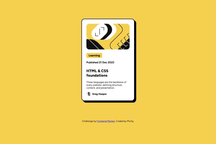
Design comparison
Solution retrospective
Conseguir termianr em um curto tempo.
What challenges did you encounter, and how did you overcome them?Com os tamanhos dos textos e tamanho da caixa de conteudo, para ficarem responsivos e no centro.
What specific areas of your project would you like help with?Em como posso melhorar tamanho de textos e titulos, e como deixar a caixa de conteudo no centor sem prejudicar o quem tem dentro.
Community feedback
- P@lynx232Posted 7 months ago
"Does the solution include semantic HTML?" Yes.
"Is it accessible, and what improvements could be made?" Try to name the classes in english in the future.
"Does the layout look good on a range of screen sizes?" The layout is way too big in 4k, try to limit it's width to 450px. Also use other measurement units in the future, for good practice, such as vh, vw, em, rem.
"Is the code well-structured, readable, and reusable?" Yes. As far as I can tell.. :)).
"Does the solution differ considerably from the design?" Yes. The card is too wide compared to the reference photo.
0
Please log in to post a comment
Log in with GitHubJoin our Discord community
Join thousands of Frontend Mentor community members taking the challenges, sharing resources, helping each other, and chatting about all things front-end!
Join our Discord
