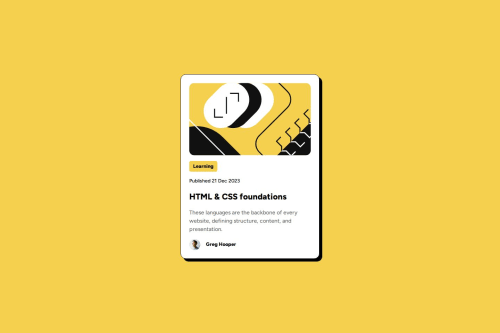
Blog Article With Flex

Solution retrospective
Big thanks to @Stroudy for their feedback on my last project. Tried to apply as much of it as I could.
Really happy with how this one turned out. Tried to avoid divs as much as possible, just to see what other html tags had to offer. Still unsure if I used them correctly, however. Avoided pixels too.
What challenges did you encounter, and how did you overcome them?I learned many new tricks since my first project, so trying to understand and apply all of them definitely took a while. I love Flex, but sometimes I can't get it to play nice. Guess I need to practice more with spacing and measurements.
What specific areas of your project would you like help with?Mostly the html tags. It's my first time using them, so I'm not too sure if I did my best with them.
Please log in to post a comment
Log in with GitHubCommunity feedback
No feedback yet. Be the first to give feedback on FirstHalcyon's solution.
Join our Discord community
Join thousands of Frontend Mentor community members taking the challenges, sharing resources, helping each other, and chatting about all things front-end!
Join our Discord