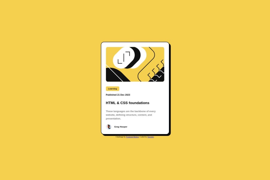
Design comparison
Solution retrospective
Simple and great project, submitted with simple and responsive CSS and Loveβ€οΈ.
Community feedback
- @danielmrz-devPosted 10 months ago
Hello @Naveen-CB!
Your solution looks excellent!
I have a couple of suggestions:
- Use
main
to wrap the main content instead ofmain
andarticle
.
π The tag
article
would make more sense if the card was part of a bigger website (in certainly would in real world), but here it is all we have on the screen.- Also, don't skip heading levels - start with
<h1>
, then use<h2>
, and so on.. Unlike what most people think, it's not just about the size and weight of the text.
π The
<h1>
to<h6>
tags are used to define HTML headings.π
<h1>
defines the most important heading.π
<h6>
defines the least important heading.π Only use one
<h1>
per page - this should represent the main heading/title for the whole page.Those tag changes don't impact your project visually and make your HTML code more semantic, improving SEO optimization as well as the accessibility of your project.
I hope it helps!
Other than that, great job!
Marked as helpful1@Naveen-CBPosted 10 months ago@danielmrz-dev Thank you for a helpful feedback, but I also wonder how to get pixelperfection can you have any suggestion or video/article to explain that?
1@danielmrz-devPosted 10 months ago@Naveen-CB
The only way to get pixel perfection is having the design figma files that explicits all the exact measures. Other than that, we have to do it by eye π
1@Naveen-CBPosted 10 months ago@danielmrz-dev Oh π let's take ruller to measure it on the screen.
1@danielmrz-devPosted 10 months ago@Naveen-CB
I swear I already did that a few times π€£π€£π€£
1 - Use
Please log in to post a comment
Log in with GitHubJoin our Discord community
Join thousands of Frontend Mentor community members taking the challenges, sharing resources, helping each other, and chatting about all things front-end!
Join our Discord