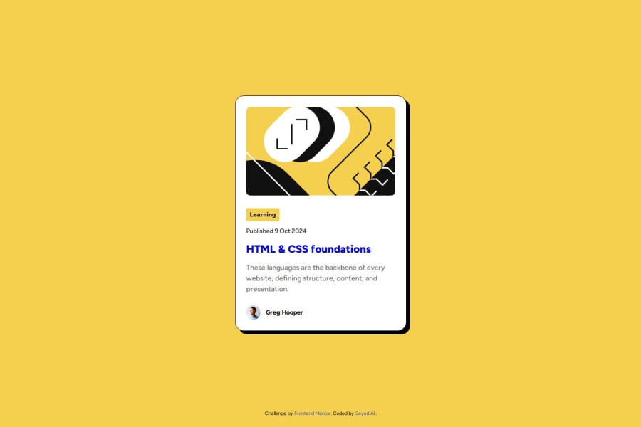
Design comparison
Solution retrospective
This project was the first time where I used the CSS clamp() function. I've been doing CSS for years but never thought of its use cases, until the instructions of this challenge asked to find a way to make responsive fonts without media queries!
I'm also learning about code design patterns. Although I had the option to hard code styles for each element, I created reusable styles for each font from the provided style guide. My HTML ended up having both utility classes as well as semantic classes to be targeted in the CSS. Is this an acceptable practice?
Community feedback
- @YacoubDweikPosted 6 months ago
Hey Sayed! What a nice code and design! One little advice, it's gonna be much more better for you instead of just making the whole body as a flexbox what you can do is this: position: absolute; top: 50%; left: 50%; transform: translate(-50%, -50%); || Give it to the main element and see the magic! عاشت ايدك :)
Marked as helpful1P@sydalwedaiePosted 6 months ago@YacoubDweik Salam brother! Thank you for the kind words. Yes, that's a popular centering technique. Is there a performance benefit to using it over Flexbox? I wonder when would you prefer one over the other. Thanks again.
1@YacoubDweikPosted 6 months ago@sydalwedaie Salam man!
It is the best practice so for for many reasons like:
-
Simplicity: This method involves fewer lines of code compared to setting up Flexbox or Grid properties, making it quick and easy to implement for simple centering needs.
-
Cross-browser Compatibility: This technique is well-supported across various browsers, including older versions, ensuring consistent results without the need for vendor prefixes or workarounds.
-
Consistent Centering: The combination of top: 50%; left: 50%; positions the element's top-left corner at the center of its containing element, and transform: translate(-50%, -50%); moves the element back by half of its own width and height, effectively centering it perfectly both horizontally and vertically.
-
No Parental Constraints: Unlike Flexbox or Grid, where the parent container's properties can affect the child element's positioning, absolute positioning allows the element to be centered independently of its parent's layout.
Marked as helpful0 -
- @chilldeleuzePosted 6 months ago
I like how clean your html code looks, aswell as the solution using clamp()
I think mixing in some utility classes to handle typography is perfectly sensible.
0
Please log in to post a comment
Log in with GitHubJoin our Discord community
Join thousands of Frontend Mentor community members taking the challenges, sharing resources, helping each other, and chatting about all things front-end!
Join our Discord
