Design comparison
Community feedback
- @N-andronic1991Posted 1 day ago
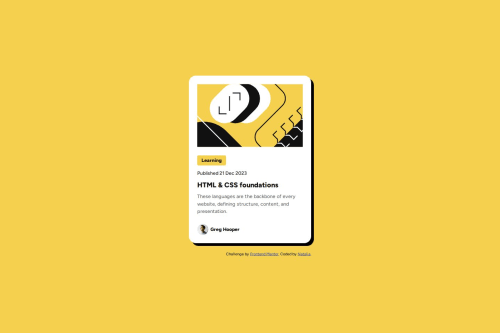
Hello everyone! I made the landing of this block-card-component firstly as fixed (using px units for sizes) and responsive (using media queries), but after reading all comments on how to improve my code I rewrote my code according to feedback (used rem units and CSS clamp()function) I still have my component differ from design, my decorative image looks smaller than at layout design. Can somebody advice how to make it looks the same(you can see the difference on the screenshot above). Thank you
0 - @kaamiikPosted 11 days ago
Hi. Congrats for doing this challenge. I wanna mention some notes in your code:
- In your HTML, I see your first element is a
div
but at the end you finished with amain
. I think Its more clean that put your container class inside the main element.
- Why using
.tab
as aspan
tag? You can usep
if you see this a text or If you see this a tag that takes you to a new page, use ana
tag.
- Decorative images do not need an alt message and inside your
img
tag thealt
attribute should be empty likealt=""
. It seems that the top image is decorative here.
- Elements that have hover effect are interactive.
So because you have hover effects for your
h1
then It needs to bea
orbutton
. Now you have too choose betweena
andbutton
. If the element take you to a new page It should be ana
tag and If do an action like submit a form or add to cart then It should be abutton
. In your challenge you haveh1
and inside theh1
you have to wrap it into a interactive element too.
- Avatar images do not need alt message.
- Try to use a proper CSS reset at the start of your CSS style. Andy Bell and Josh Comeau both have a good one. You can simply search on the internet to find them.
- Use
min-height: 100vh;
instead ofheight:100vh;
.height: 100vh
strictly limits the height to the viewport size, potentially causing overflow issues if the content is larger than the viewport. On the other hand,min-height: 100vh
allows your element to grow in height if the content exceeds the viewport size.
- Your
font-size
andmax-width
should be inrem
unit notpx
. You can read this article about it and why you should not usepx
as a font-size.
- There is no need to use fixed positioning for your footer. It cause some problems in your page. and There is no need here to use it.
0@N-andronic1991Posted 11 days ago@kaamiik Hi, thanks you very much for your feedback. I’m going to improve my code using your advice. I understand how to use rem for font-size, but how to use it for max- width? (for example max-width: 300px- in rem? ) could you help with this, please?
0@kaamiikPosted 11 days ago@N-andronic1991 Yes. For example in this challenge for your
.container
there is no need to usewidth
and media query to change it. and I explained why you should not limit your width and height. The container max-width should be 384px that means384/16rem = 17.75rem
Marked as helpful0 - In your HTML, I see your first element is a
Please log in to post a comment
Log in with GitHubJoin our Discord community
Join thousands of Frontend Mentor community members taking the challenges, sharing resources, helping each other, and chatting about all things front-end!
Join our Discord