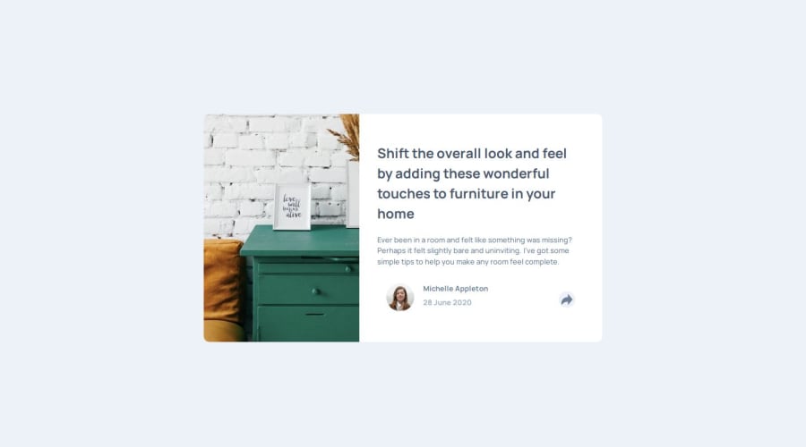
Design comparison
Solution retrospective
I'm happy to learn about javascript events for the first time.
I preferred adding classes to change the display instead of modifying the style directly.
This was my first time using position absolute.
What challenges did you encounter, and how did you overcome them?I had many challenges with this one.
-
Border radius overflow- My image div kept spilled over the border radius of the card. I tried using the overflow property but ended up needing to add more radius css to the child :/. I'm sure there is a better way
-
Mobile height - In the mobile version the image wasn't displaying. I finally realized the height of the page was too small and manually set it to a huge number. I imagine there is a better way to do this.
-
Message box - the share button was supposed to be a message box but I couldn't figure out a good way to do that. I saw people online adding a separate triangle div, to me that seems pretty finnicky.
-
Share button on mobile - I could not think of a good way to get the share button to display like it does on the mobile version.
-
Positioning the message box - I positioned the message box as relative to it's position, but I wish I found a way to position it relative to the share button - because that's really where it belongs.
-
Used background over
img- I was having trouble getting the image to crop the way it does in the example. I replaced theimgcomponent with a div that had the image as a background which seemed to help.
Any of the problems I listed above.
Community feedback
Please log in to post a comment
Log in with GitHubJoin our Discord community
Join thousands of Frontend Mentor community members taking the challenges, sharing resources, helping each other, and chatting about all things front-end!
Join our Discord
