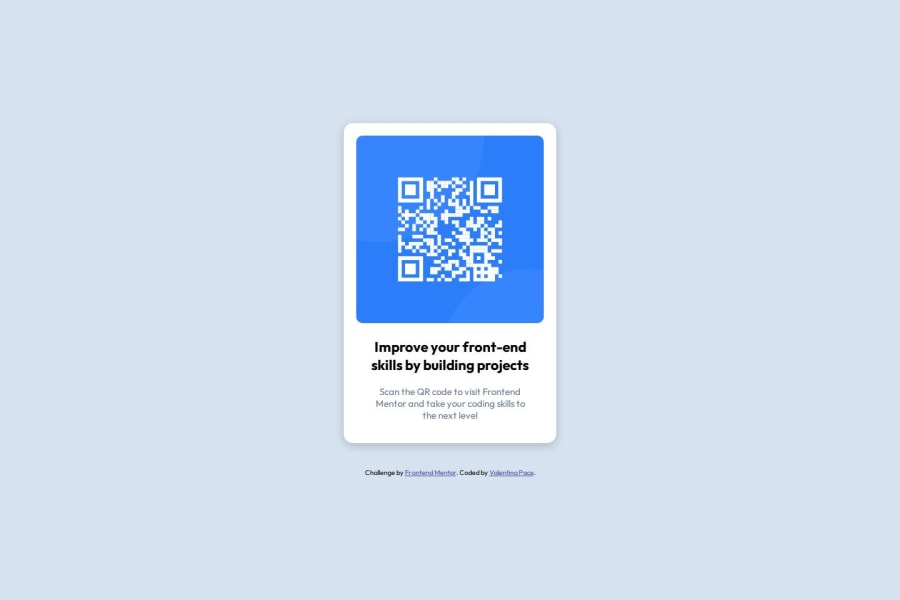
Design comparison
Please log in to post a comment
Log in with GitHubCommunity feedback
- @BrianMunizSilveira
Feedback for QR Code Component Challenge
Your project looks great! The layout is well-presented and functional. Here are some suggestions to make your solution even better:
Strengths
- Good Centering
- The use of
display: flex,justify-content: center, andalign-items: centerin thebodyensures consistent horizontal and vertical alignment.
- The use of
- Organized Code
- The HTML structure is clean and semantic, with clear separation of main content and attribution details.
- Simple and Effective Responsiveness
- Using
min-height: 100vhin thebodyensures that the content fills the screen properly.
- Using
Suggestions for Improvement
1. Accessibility
- The QR code image has an
altattribute, which is great! However, the text can be more descriptive to assist screen readers:
<img src="./images/image-qr-code.png" alt="QR Code leading to Frontend Mentor website">2. Improve Typography Hierarchy
- The <h2> title can be slightly larger to emphasize the main text:
.card h2 {
    font-size: 18px;
    font-weight: 700; /* Makes the title stand out more */
    color: hsl(218, 44%, 22%);
3. Enhance Responsiveness
- The fixed image size (
width: 300px) may cause issues on smaller screens. Use a flexible width instead:
.card img {
    max-width: 100%; /* Automatically adjusts to container size */
    height: auto; /* Maintains image proportions */
}
4. Add Padding for Smaller Screens
- Consider adding padding to the
bodyor.containerto prevent content from sticking to the edges on smaller devices:
body {
    padding: 10px;
    box-sizing: border-box; /* Ensures padding is included in the layout */
}
5. Enhance Text Readability
- Add line spacing to paragraphs to improve readability:
.card p {
    line-height: 1.5; /* Improves text clarity */
}
6. Add Sibtle Animation
- You can add a professional touch by including a shadow animation when hovering over the card:
.card:hover {
    box-shadow: 0 6px 20px rgba(0, 0, 0, 0.3);
    transition: box-shadow 0.3s ease-in-out;
}
Summary
Your project is already in great shape! With small improvements like responsive image adjustments, better typographic hierarchy, and accessibility refinements, it can look even more polished.
Keep practicing and experimenting with new ideas. You’re doing amazing! 🚀
Marked as helpful - Good Centering
- @Simonbiker
Its great well done. Keep it up. Getting something centre is not always the easyist.
Join our Discord community
Join thousands of Frontend Mentor community members taking the challenges, sharing resources, helping each other, and chatting about all things front-end!
Join our Discord
