

Design comparison
SolutionDesign

Solution retrospective
What challenges did you encounter, and how did you overcome them?
I have been always avoiding display:grid, because display:flex is much easier for me to understand. I decided to try it this time. It turned out very confusing for me!
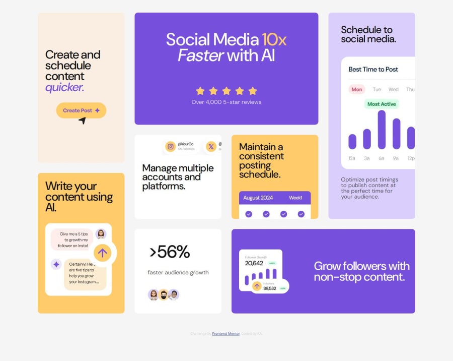
After much struggle, I managed to finish this project. Whew.... I still can't figure out why the margin bottom disappears on a mobile screen. And the layout of images in each card is still questionable. But I'd like to pat myself on the back anyway.
Please log in to post a comment
Log in with GitHubCommunity feedback
No feedback yet. Be the first to give feedback on K's solution.
Join our Discord community
Join thousands of Frontend Mentor community members taking the challenges, sharing resources, helping each other, and chatting about all things front-end!
Join our Discord