

Design comparison

Solution retrospective
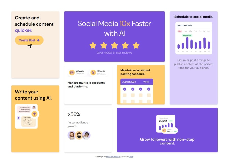
It is far from perfect and any feedback regarding the layouts will be really helpfull.
Community feedback
- @bhuvi819381Posted 3 months ago
Hello,
I reviewed your solution, and it looks impressive! Here are a few suggestions for improvement:
-
📄 Update README Template Make sure to update your README template and upload it to your repository. It helps keep your project documentation organized.
-
🏷️ Use Semantic Tags Add semantic tags like <main>, <section>, <footer>, etc., to improve the structure and accessibility of your code.
-
📖 Use One <h1> and Follow Heading Hierarchy Include only one <h1> tag per page and organize headings logically: <h1>, <h2>, <h3>, etc.
-
✍️ Use <p> Instead of <div> for Text When wrapping text, use <p> tags instead of <div> for better semantics and readability.
-
📁 Organize CSS Files Place your .css files in the root or a designated styles folder rather than the assets folder. It helps maintain clarity in your folder structure.
-
🌟 Pixel Perfect Design If you don't have a Figma file, you can use a Chrome extension called Pixel Perfect by WellDone.
-
🛠️ Check for Errors After submitting the solution, always check the error report of HTML and accessibility. If you find errors, just solve them.
Great job so far! These tweaks will make your project even more professional and polished. Keep up the excellent work! 👏
Best regards, A Frontend Friend
0 -

Please log in to post a comment
Log in with GitHubJoin our Discord community
Join thousands of Frontend Mentor community members taking the challenges, sharing resources, helping each other, and chatting about all things front-end!
Join our Discord