

Design comparison
SolutionDesign

Solution retrospective
What specific areas of your project would you like help with?
I could not get the grid to look the way it does in the example for desktop view and I have no idea how I could accomplish it. I did my best but if anyone has tips to make it look the way it should please out your input in. Thanks in advance! :D
Community feedback
- @mbank14Posted 3 months ago
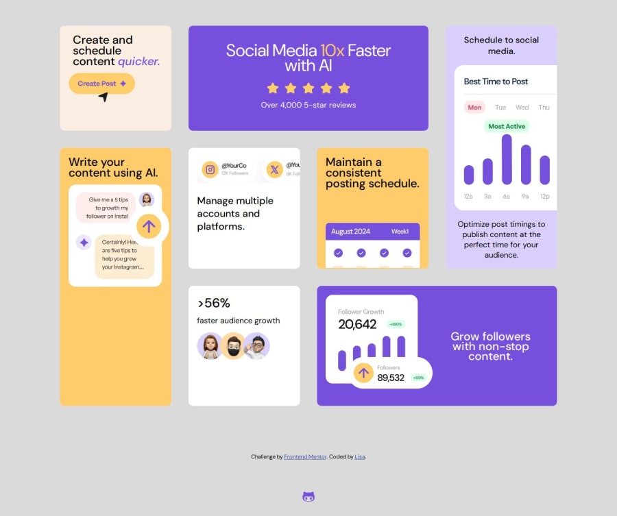
Hello, great job earlier! Using CSS Grid can indeed be a bit tricky sometimes. Before diving into the grid, my suggestion is to set the media query at
min-width: 1200pxand create a.containerclass withmax-width: 1440px:.grid-container { display: grid; justify-content: center; grid-template-columns: 300px 300px 300px 300px; /* add new properties */ grid-template-rows: repeat(4, auto); } .social-media { grid-column: 2 /4; grid-row: 1 /2; } .multiple-accounts { grid-column: 2 /span 1; grid-row: 2 /4; overflow: hidden; } .consistent { grid-column: 3 /span 1; grid-row: 2 /4; } .create { grid-column: 1 /span 1; grid-row: 1 /3; } .ai { grid-column: 1 /span 1; grid-row: 3 /5; }Great job, I hope this helps!
0

Please log in to post a comment
Log in with GitHubJoin our Discord community
Join thousands of Frontend Mentor community members taking the challenges, sharing resources, helping each other, and chatting about all things front-end!
Join our Discord