BEM Naming Convention HTML5 CSS3 Responsive Design
Design comparison
Solution retrospective
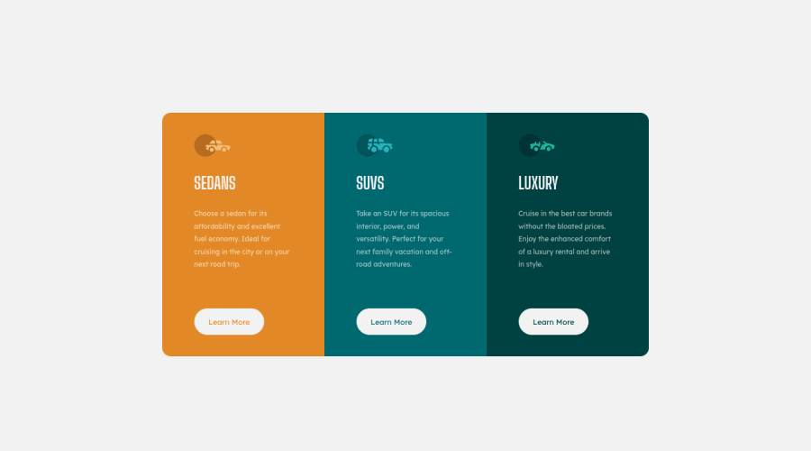
Hello I am on my third front end mentor project. I think these projects are great practice to master front end development. It is sometimes hard to think of projects to do on our own. For this project, like always, please rate my code from 1 -10, don't hesitate to make remarks on how clean my code is or ideas on how I can improve my code. Also, please look at my BEM Naming convention if I am using them correctly. My question after this project is, is this how real life front end jobs look like..by this I mean external designers or designers on our teams create jpeg mockup and as front end web devs we try to get as close as possible to the mockup? In real life, do they give the dimensions of things like padding, margin, width? Do they give things like the fonts they want us to use, color codes or as devs do we kinda of just guess or through trial and error figure these things out? I guess this is a question for people already working!! Thank you for taking the time to rate my work on this project and trying to answer my questions.
Community feedback
- @rufflehufflePosted about 3 years ago
Hello Jaonary,
Great work! I love to see other web devs using BEM, as I've just began using it in my projects as well. As someone whose used BEM in a handful of projects here's my advice:
- Write modifiers with a double dash (--) instead of a single dash (-). For example, on line 19 it should be
<section class="product product--orange">
. Reference - Make sure you have proper indentation, this will make your code much more readable. This can be easily automated using VSCode and Prettier, if you're not using them already.
- Add hover states to your CSS, using the
:hover
selector. For example, you could have the cursor change to a pointer when hovering over buttons. - For your future projects using BEM, you might want to look into SCSS. It has a nice parent selector feature, that makes styling BEM a whole lot easier.
- Fonts can be imported into CSS easily, just use the @import instead of <link> setting in Google Font. For example, lines 7-14 in your HTML removed if you add this 1 line to the top of your CSS:
@import url('https://fonts.googleapis.com/css2?family=Big+Shoulders+Display:wght@700&family=Lexend+Deca&display=swap');
Hope this feedback helps!
0@rufflehufflePosted about 3 years agoAlso, to answer your other question. Web devs generally create sites using a detailed mock-up from a designer. These mock-ups are created in a designing software, such as Figma or Sketch, and contain information about the padding, margins, etc. of each element. These design files are available in challenges if you are a PRO user of Frontend Mentor.
0 - Write modifiers with a double dash (--) instead of a single dash (-). For example, on line 19 it should be
Please log in to post a comment
Log in with GitHubJoin our Discord community
Join thousands of Frontend Mentor community members taking the challenges, sharing resources, helping each other, and chatting about all things front-end!
Join our Discord