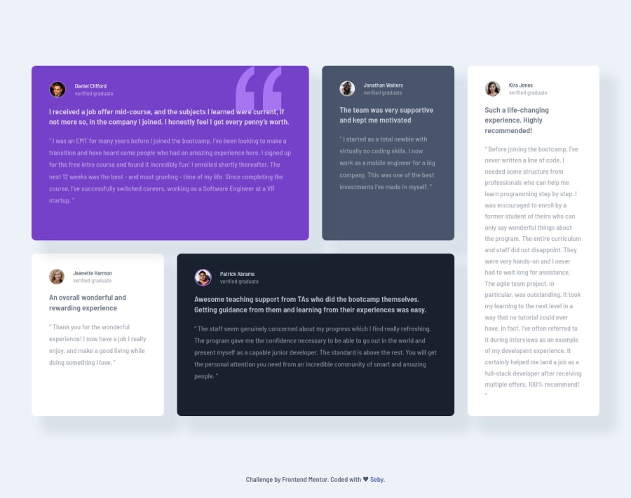
Design comparison
SolutionDesign
Solution retrospective
Used Sass and BEM methodology to complete this project.
Community feedback
- @ApplePieGiraffePosted about 4 years ago
Hey, nice job, Sebastien! 🙌
Your solution looks good and is responsive! 👍
I suggest,
- Switching to a mobile-friendly layout a little sooner than 740px so that the testimonial cards do not look so squeezed right before the layout changes.
- Decreasing the line-height of the text just a little would be a good touch, I think.
Keep coding (and happy coding, too)! 😄
0@SebystienPosted about 4 years ago@ApplePieGiraffe Hey Apple, thank you for taking the time to review my code, means a lot. Will fix it right away to 600px!👍 Thanks again!
0
Please log in to post a comment
Log in with GitHubJoin our Discord community
Join thousands of Frontend Mentor community members taking the challenges, sharing resources, helping each other, and chatting about all things front-end!
Join our Discord
