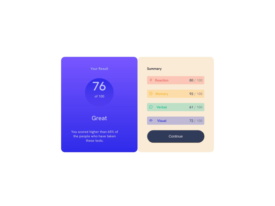
Beginner solution to results summary component page


Design comparison

Solution retrospective
Hey guys this was my first attempt with learning html/css at this and while i think it went well there were a few parts i struggles with. First, when i added a width to the "you scored higher div" it took it out of the align center and i wasnt sure why that was happening or what a clean fix was. Second, to try and get the right side to be overlapped by the left i was trying to set the z-index of it to -1, however when i did that the button stopped working even when i set the button to z-index of 1. Feedback and comments are most welcome!
Community feedback
- @NehalSahu8055Posted over 1 year ago
Hello Coder 👋.
Congratulations on successfully completing the challenge! 🎉
Few suggestions regarding design.
-
Use gradient
button:hover -
background-image: linear-gradient(#6542FE,#342CE2); -
Use
cursor: pointeron the button for user-friendliness. -
Replace
height:100vhwithmin-height:100vhin thecontainerfor properly center the card. -
Use
Semanticsfor the proper design of your code.
<body> <header> <nav>...</nav> </header> <main>...</main> <footer>...</footer> wrap up .attribution div inside footer. </body>-
Every site must have one h1 element describing the main content of the page. So, Add a level-one heading.
-
It would be better if you use source media for switching to screen sizes(mobile or desktop) for image.
<picture> <source media="(min-width:800px)" srcset="yourimage.jpg"> <img src="yourimage.jpg" alt="description"> </picture>- Use
aria-label, sr-onlyto make your card accessible to the screen reader. - Use
responsive units(rem, em, %)from next project to increase responsiveness. Explore respective use cases on google.
link.
- Use
max-widthinstead ofwidthto make your design responsive.
I hope you find this helpful.
Happy coding😄
1 -
- @Matthew7991Posted over 1 year ago
Hey congrats, while I'm also just a beginner i will try to answer your questions at least :D
- The text itself is still centered. But since you limited the width you have to center the element not just the text.
You could do this by either using
.paragraph {align-self: center}as you did with the circle container.Alternatively you can use
.left-container {align-items: center)on the parent container instead since you want all items centered anyway.Last option would be to use
.paragraph {margin: 0 auto}which distributes any free space to the left and right of the element equally, but since you already use flex it would make sense to stick with the first two.- Regarding the z-index. Since you set the index of the right container to -1 it will be behind the .container which you can see if you give it a background color.
Because z-index has to be seen relative to it's parent and siblings and the button is a child of the .right-container it giving it a z-index of 1 only puts it above it's parent or other siblings but since the parent itself is behind something it won't change anything.
Though that said it don't understand why you want to set a z-index in the first place if it's for the background color. you could give .container the background color and then give the body a flex and height instead.
Hope it helped :D
0 - @0xabdulkhaliqPosted over 1 year ago
Hello there 👋. Congratulations on successfully completing the challenge! 🎉
- I have other recommendations regarding your code that I believe will be of great interest to you.
HTML 🏷️:
- This solution may cause accessibility errors due to lack of semantic markup, which causes lacking of landmark for a webpage and allows accessibility issues to screen readers, due to accessibility errors our website may not reach its intended audience, face legal consequences, and have poor search engine rankings, highlighting the importance of ensuring accessibility and avoiding errors.
- What is meant by landmark ?, They used to define major sections of your page instead of relying on generic elements like
<div>or<span>. They are use to provide a more precise detail of the structure of our webpage to the browser or screen readers
- For example:
- The
<main>element should include all content directly related to the page's main idea, so there should only be one per page - The
<footer>typically contains information about the author of the section, copyright data or links to related documents.
- So resolve the issue by replacing the
<div class="container">element with the proper semantic element<main>along with<div class="attribution">into a<footer>element in yourindex.htmlfile to improve accessibility and organization of your page
.
I hope you find this helpful 😄 Above all, the solution you submitted is great !
Happy coding!
0


Please log in to post a comment
Log in with GitHub
Join our Discord community
Join thousands of Frontend Mentor community members taking the challenges, sharing resources, helping each other, and chatting about all things front-end!
Join our Discord