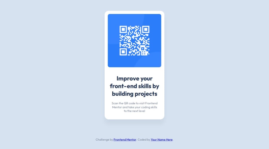
Design comparison
Solution retrospective
I am proud of grasping how to work with custom properties, as I had only been exposed to them recently through videos. I am also happy I got this uploaded properly, and just in general - incredibly happy to make this, as it was my first challenge and project in a very new area.
What challenges did you encounter, and how did you overcome them?I struggled with positioning the card component in the middle - as I am still very fresh, I am not super familiar with the usual tricks on how to position things center. I got there with a bit of help, but it for sure is a work in progress.
Also just became aware I got the font size wrong on the heading, oops, will fix that asap.
What specific areas of your project would you like help with?I think for now anything goes. I know I am not very fluent in the coding and in the community yet, and I can be very reserved and self-critical, but I am looking forward to any feedback or just words of encouragement for the future.
Community feedback
- @ARUNKUMAR2906Posted 10 months ago
This solution looks slightly similar to the challenge the layout are good and it's accessible in all screen sizes.the code is well structured and readable and reusable
0
Please log in to post a comment
Log in with GitHubJoin our Discord community
Join thousands of Frontend Mentor community members taking the challenges, sharing resources, helping each other, and chatting about all things front-end!
Join our Discord
