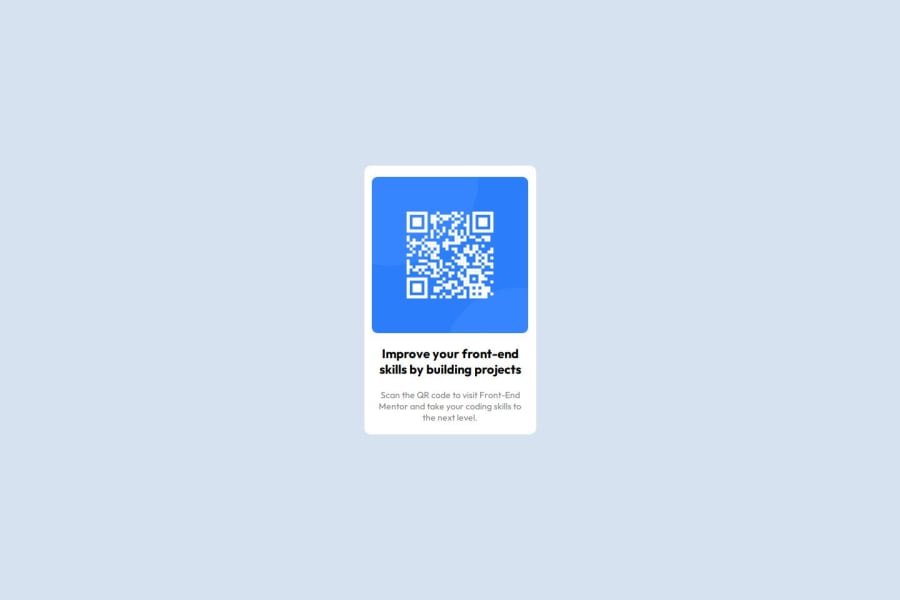
Design comparison
Solution retrospective
Proud of:
- being able to spot mistakes throught code
- being able to understand how to use position rules
- being able to correclty use hsl colors
- understanding how to use flex box properties such as justify-content as well as position
- understanding how to use padding and margin properties
Challenge:
- using the correct properties for position such as absolute and relative
Solution:
- I came to understand that a relativley positioned parent element allows you to position its child element more easily with position: absolute;. The child will be positioned relative to the nearest ancestor with position: relative;.
(To understand this further take a loot at the css file and find where i have inserted relatie and absolute on the parent and the child element. The first div being the parent element).
Challenge:
- Centering the image and creating space around the elements
Solution:
- i figured out that i could use a margin property to create space on either the left, top, right and bottom side of the picture as well as the paragraph elements.
I would like help with understanding css a bit more interms of being aware of what properties can be used when some cant or what propeties need to be used in order to create and make things responsive.
i would also like a better understanding of how to code and style code in simpler ways.
Community feedback
- @AhirgautamPosted 7 months ago
You can also consider to make it bit responsive using clamp function(if you don't know about just youtube it) it make it responsive so on larger size it does look good
0 - P@MikDra1Posted 8 months ago
-
Core Properties: Master margin, padding, border, width, height, display, and position. These are the foundation of layout and design.
-
Layout Techniques: Use Flexbox (display: flex) for simple, flexible layouts, and Grid (display: grid) for complex, two-dimensional layouts.
-
Responsive Design:
- Media Queries: Apply styles for different screen sizes using @media.
- Responsive Units: Use %, em, rem, vw, and vh to make elements adapt to screen size.
- Fluid Layouts: Avoid fixed dimensions; prefer percentages or auto for flexibility.
-
Code Simplification:
- DRY Principle: Reuse styles with classes and grouped selectors.
- CSS Variables: Define reusable values with --variable-name.
- Shorthand Properties: Reduce code with shorthand (e.g., margin: 10px 20px).
Hope you found this comment helpful 💗
Good job and keep going 😁😊😉
0 -
- @verostrizinecPosted 8 months ago
El HTML está bien estructurado. Quizas en el css hubiera utilizado menos codigo como por ejemplo los margin, y centrarlo con flexbox. Lo demas lo veo correcto.
0
Please log in to post a comment
Log in with GitHubJoin our Discord community
Join thousands of Frontend Mentor community members taking the challenges, sharing resources, helping each other, and chatting about all things front-end!
Join our Discord
