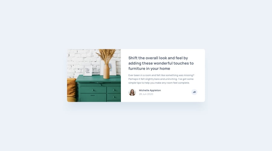
Design comparison
Solution retrospective
Hey, Frontend Mentor community,
This was the first challenge where I felt completely out of my comfort zone.
The design of the component was trivial — easy tbh. Adding the two unique states for the Share popover/controls was incredibly frustrating though. I attempted three or four approaches to creating a single solution that would work for both mobile and desktop, but no amount of Googling or experimenting helped.
If you have a moment, could you suggest a solution that improves on what I implemented? I can tell that my approach is overly complicated but don't know how I would have approached it any differently.
Thanks!
Community feedback
- @NeoScripterPosted 9 months ago
Looks nice! The only thing I would improve is that in mobile view, there are two share buttons with arrows instead of one. What you could do is to change the design of the button using JS. Since it's svg, it can be easily filled with any color. In my case, I used this code:
clearTimeout(timeoutId); socialLinks.style.display = 'flex'; svgPath.style.fill = 'white'; shareBtn.style.backgroundColor = 'hsl(217, 19%, 55%)'; } function hideSocialLinks() { timeoutId = setTimeout(function() { socialLinks.style.display = 'none'; shareBtn.style.backgroundColor = 'hsla(212, 23%, 69%, 0.2)'; svgPath.style.fill = ''; }, 500); }1@Scott1UPPosted 9 months agoAnother great suggestion @NeoScripter!
At this point, I had next to no JS experience so it is awesome to hear that there are simpler alternatives to my previous approach :)
1@NeoScripterPosted 9 months agoI also don't have too much experience with JS, just learning it now, but it's really great. I'm glad my suggestion was helpful! @Scott1UP
1
Please log in to post a comment
Log in with GitHubJoin our Discord community
Join thousands of Frontend Mentor community members taking the challenges, sharing resources, helping each other, and chatting about all things front-end!
Join our Discord
