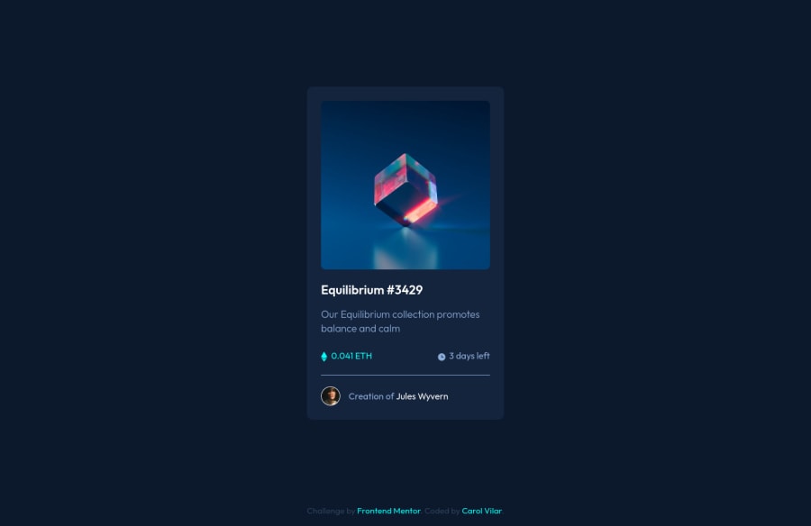
Design comparison
Community feedback
- @Sdann26Posted almost 3 years ago
Hi Bo!
Needless to say, your design is perfect!
I might add transitions to the other elements that have a hover effect.
I would recommend adding the following two attributes to your
.nft__card--linkclass:border-radius: 8px; overflow: hidden;So that the blue background effect doesn't come out square and comes out with rounded edges.
Finally to the
<div class="attribution">change it to<footer class="attribution">.And ready you can generate a report without any error.
Congratulations for putting so much effort to your layout, keep it up.
Good Coding.
Marked as helpful0@Caroline-Barbosa-VilarPosted almost 3 years ago@Sdann26
Hi,
Thanks for the insights! I completely forgot about the borders of the hover effect!
1
Please log in to post a comment
Log in with GitHubJoin our Discord community
Join thousands of Frontend Mentor community members taking the challenges, sharing resources, helping each other, and chatting about all things front-end!
Join our Discord
