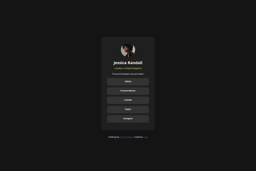
Design comparison
Solution retrospective
I'm most proud that I didn't need any help on this task and managed to find all the solutions, hopefully this means that things are starting to sink in.
What challenges did you encounter, and how did you overcome them?The only real challenge I cam across was to get the profile to become circular which with a little trial and error I managed to sort out.
What specific areas of your project would you like help with?As far as I'm aware nothing on this one.
Community feedback
- @DylandeBruijnPosted 4 months ago
@BozJR
Hiya! š
Congratulations on your solution, it looks very close to the design! I can tell you put a lot of effort into it.
Things I like about your solution š
- Use of semantic HTML elements
- Clear descriptive CSS classes
- Use of CSS custom properties
Things you could improve āļø
-
Add a bit of padding to your body element so the card has room to breath on smaller viewports.
-
Change the
height
on yourbody
element tomin-height: 100vh
so thebody
is100vh
at a minimum but still is able to grow. -
Try using relative CSS units like
rem
for yourfont-size
so they are scalable. -
I would suggest making your card and the text a bit bigger so it's easier to read.
-
You don't have to wrap your image in a separate
<div>
, you can style the image directly and achieve the same result. -
You can set
text-align: center
on the card (parent) and remove it from the childs. Child elements inherit CSS from their parent due to the CSS cascade. So you only have to write the CSS rule once instead of declaring it multiple times. -
You can turn your buttons into
<a>
tags with ahref
attribute to get the typical functionality with a pointer cursor.
I hope you find my feedback valuable, and I would appreciate it greatly if you could mark my comment as helpful if it was! š
Let me know if you have more questions and I'll do my best to answer them. šāāļø
Happy coding! š
Marked as helpful0 - @danielmrz-devPosted 4 months ago
Hey there!
Congrats on finishing the challenge! ā
Your solution looks awesome!
š It's a good idea to use the anchor tag
<a>
when you have links to other pages on your project.Here's an example of how you can refactor your code:
After Refactoring
<ul class="list-container"> <li><a href="#">Github</a></li> <li><a href="#">Frontend Mentor</a></li> <li><a href="#">LinkedIn</a></li> ... </ul>
Hope this helps!
Keep up the great work!
0
Please log in to post a comment
Log in with GitHubJoin our Discord community
Join thousands of Frontend Mentor community members taking the challenges, sharing resources, helping each other, and chatting about all things front-end!
Join our Discord