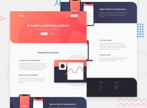
Design comparison
Solution retrospective
First exercise of responsive layout, really what cost me the most was to program the navbar menu, I still have to polish some details, it is a work in progress, I hope your constructive feedback, greetings.
Community feedback
- @pikapikamartPosted over 3 years ago
great work on your first work. A suggestion, well, maybe changing the breakpoint width of your
min-widthwould be a great Idea, since as it is now, it is set tomin-width: 1440pxand only users with resolution higher or set to that will see the desktop layout, which in my case, I only got 1366 and most others as well. So maybe tweak it at aroung 1000px higher would be awesome so that we could see your design propely without having to zoom out. Hoping to see you polish the other part and don't forget to commit it so that we could see it as well^1@renzo4webPosted over 3 years ago@pikamart Thanks pika for the answer, you are right, I will improve that.
0
Please log in to post a comment
Log in with GitHubJoin our Discord community
Join thousands of Frontend Mentor community members taking the challenges, sharing resources, helping each other, and chatting about all things front-end!
Join our Discord
