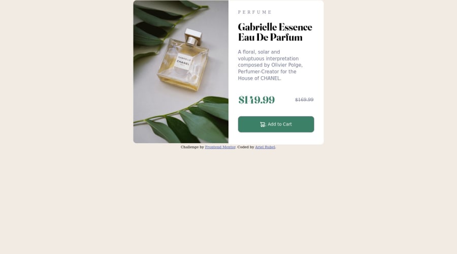
basic responsive card using flex and media qwery
Design comparison
Solution retrospective
Tips and advice always welcome
Please log in to post a comment
Log in with GitHubCommunity feedback
- @DrMESAZIM
Hi Ariel
Your solution looks good , I do have some suggestions to make it better.
Firstly I failed to get to your repository using the details you submitted . To help solve this I hope this YouTube video will guide you accordingly
Submit Frontend mentor solution using GitHub : https://www.youtube.com/watch?v=BW0FCFV323s&t=63s
Secondly lets position our solution at the middle of the screen by setting the properties on class "container" on line 58 file index.html to
.container{ display:flex; justify-content: center; align-items: center; height: 100vh; align-items: center; }
Marked as helpful - @alieuk61
Desktop design looks great but the mobile design is supposed to be different, also can you please put the correct link to your code? because when I click it, it comes up with page not found. :)
- @DrMESAZIM
hi please refer to my YouTube video which I did , as i reviewed your code and made some proposed changes on the link below. For easy access use the YouTube chapters in the video description
https://www.youtube.com/watch?v=uitqTDi37eI&feature=youtu.be
Join our Discord community
Join thousands of Frontend Mentor community members taking the challenges, sharing resources, helping each other, and chatting about all things front-end!
Join our Discord
