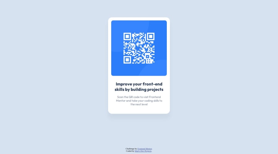
Design comparison
SolutionDesign
Solution retrospective
My attention to detail was not nearly as good as I thought it was. After checking the Figma file I think I got very close to the answer.
My main question: Does the HTML and CSS seem to be written with best practices, or are there more clear ways of writing them?
Thank you!
Community feedback
- @abubakr01Posted 11 months ago
No actual better way. You have done beautifully well. The important thing is just to replicate the design.
1 - @danielmrz-devPosted 11 months ago
Hey, Matt!
Congrats on your first project!
I have a few tips for yout to improve it, since you asked for feedback:
- Using
margin
is not the best way to place your card in the middle of the page in this case. You can do that instead:
body { height: 100vh; display: flex; justify-content: center; align-items: center; }
I hope it helps!
Other than that, my friend, I think you've written very good code. Great job!
1 - Using
Please log in to post a comment
Log in with GitHubJoin our Discord community
Join thousands of Frontend Mentor community members taking the challenges, sharing resources, helping each other, and chatting about all things front-end!
Join our Discord